Seattle eyewear store by Best Practice Architecture is designed to "toy with perception"
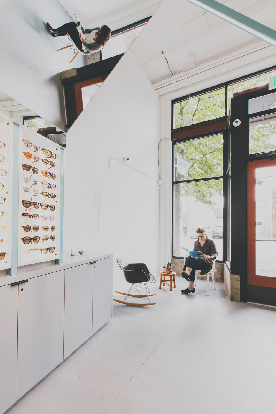
This Seattle optometry store by local firm Best Practice Architecture features mirrored surfaces and a steel-framed enclosure shaped like a house.
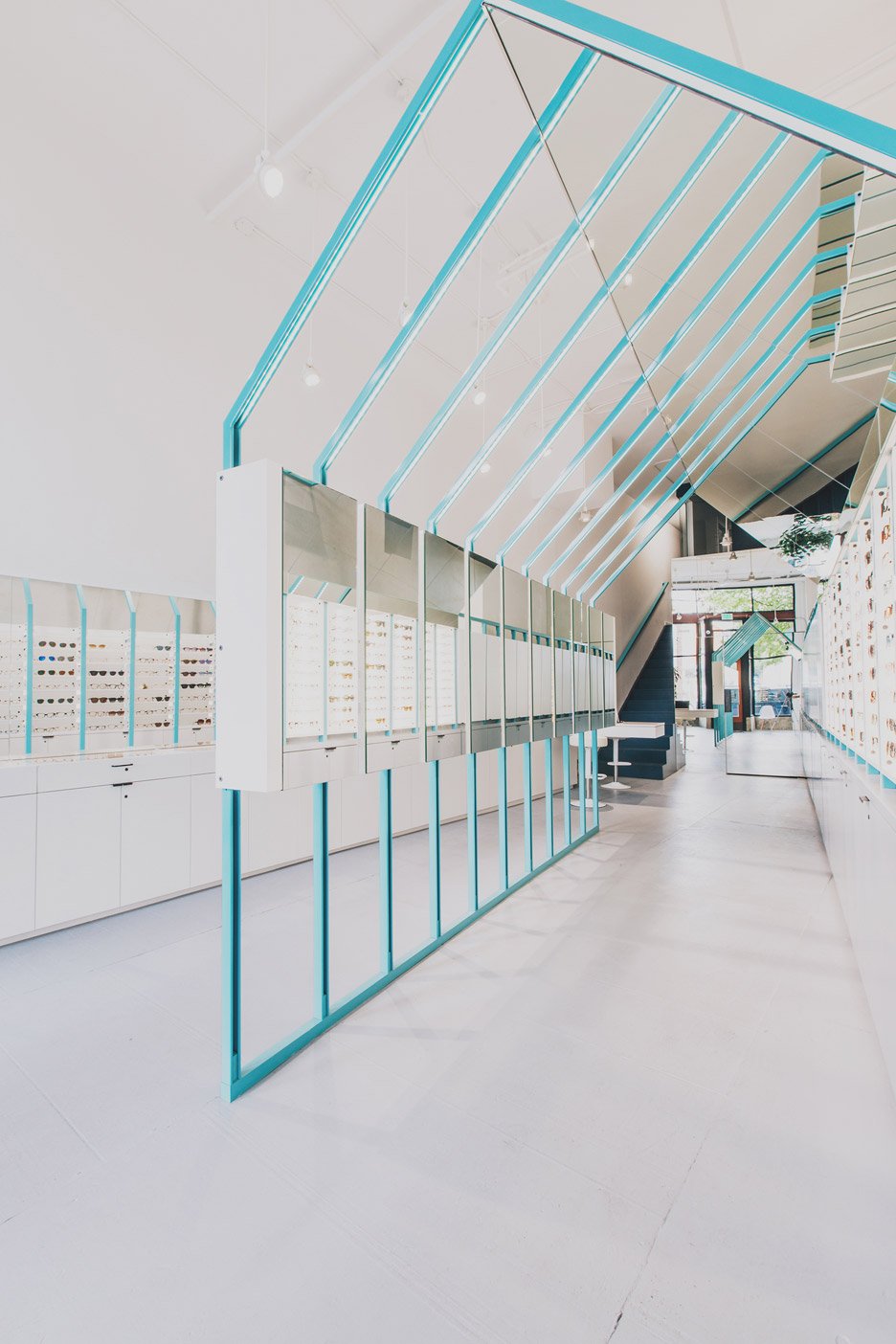
Called Eye Eye, the store is located on the ground level of a century-old brick building in Capitol Hill, a popular neighbourhood in Seattle.
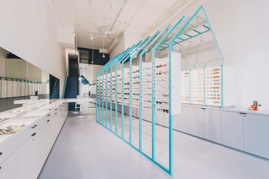
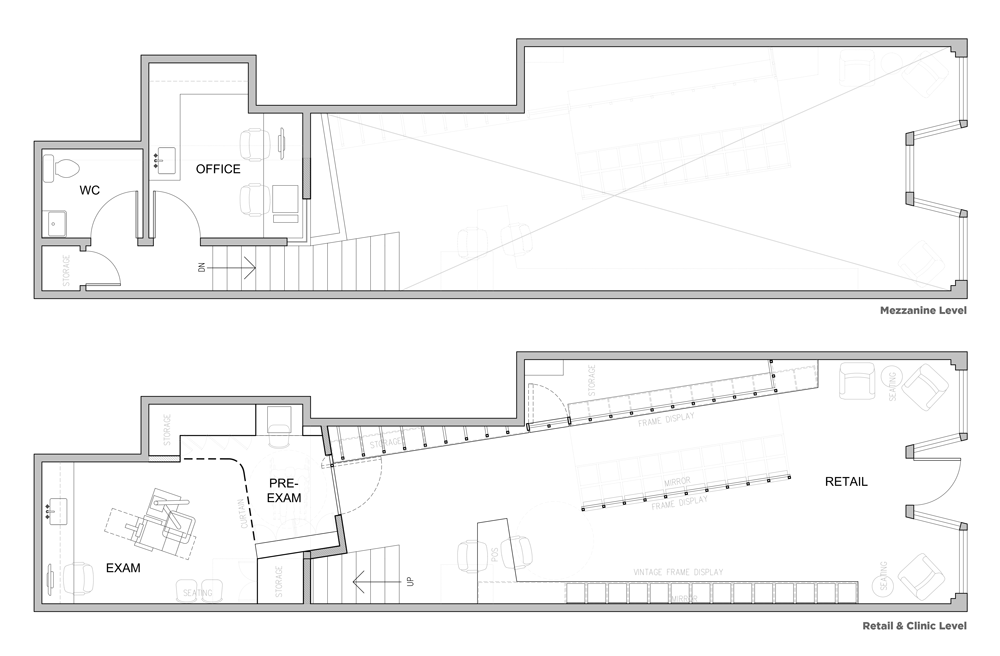
Encompassing 1,000 square feet (93 square metres), the double-height volume contains a retail area, exam room, office, restroom and storage. The narrow shell formerly housed a children's clothing shop.
When the project began, the owner, an optometrist, asked the architects to integrate "information about vision and optics" into their design scheme.
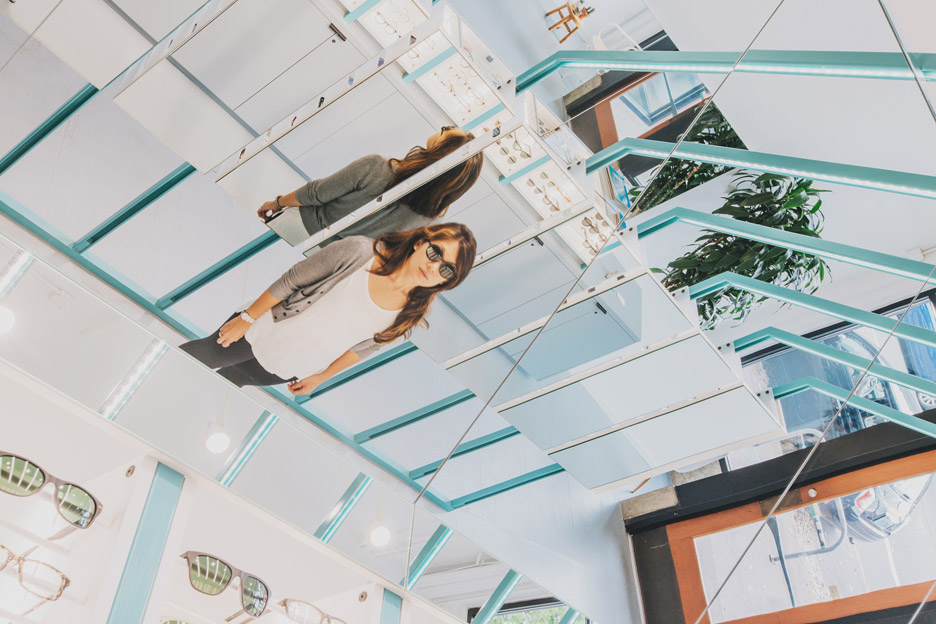
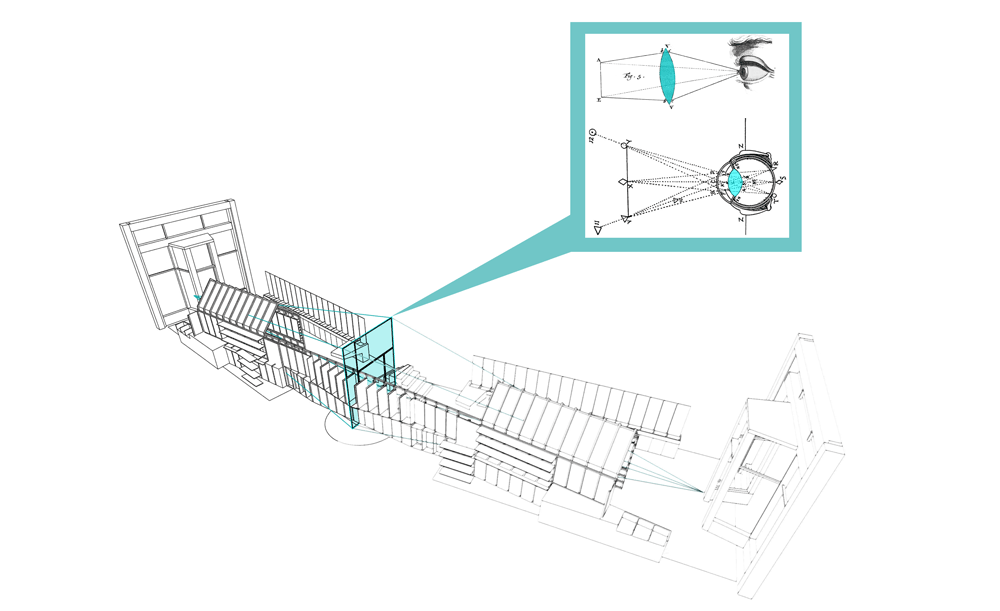
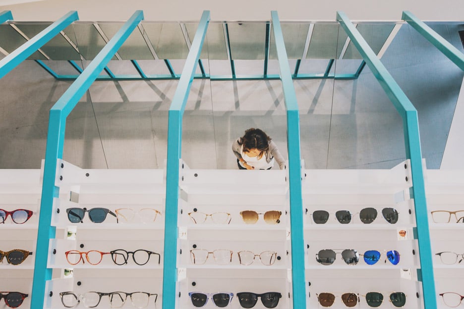
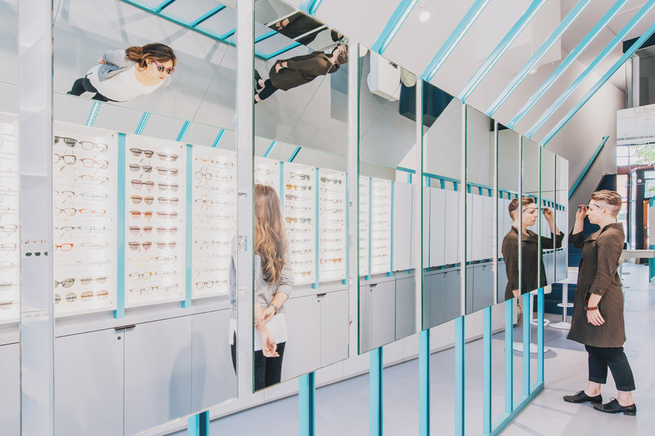
"The design team looked to the inner workings of the eye and aimed to toy with perception and reflection as you move through the space, giving the visitor multiple viewpoints simultaneously," said Best Practice Architecture.
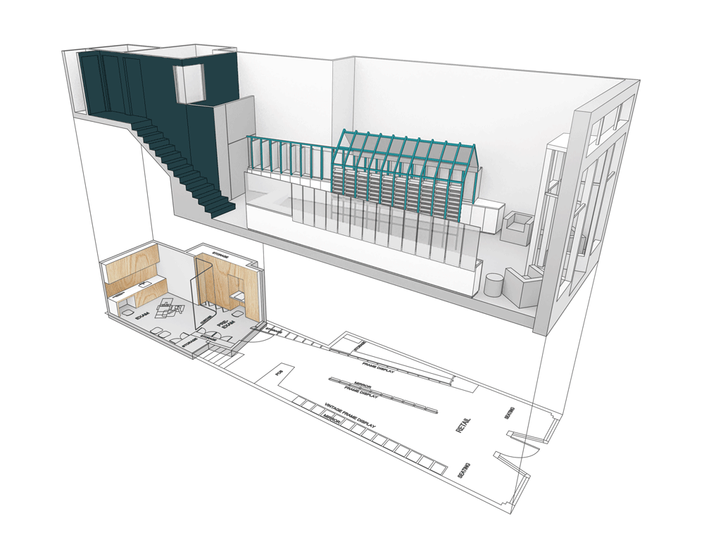
The architects painted the walls white and retained a small mezzanine in the rear of the space. The retail zone is closest to the street, and the eye clinic – which requires privacy – occupies the back portion.
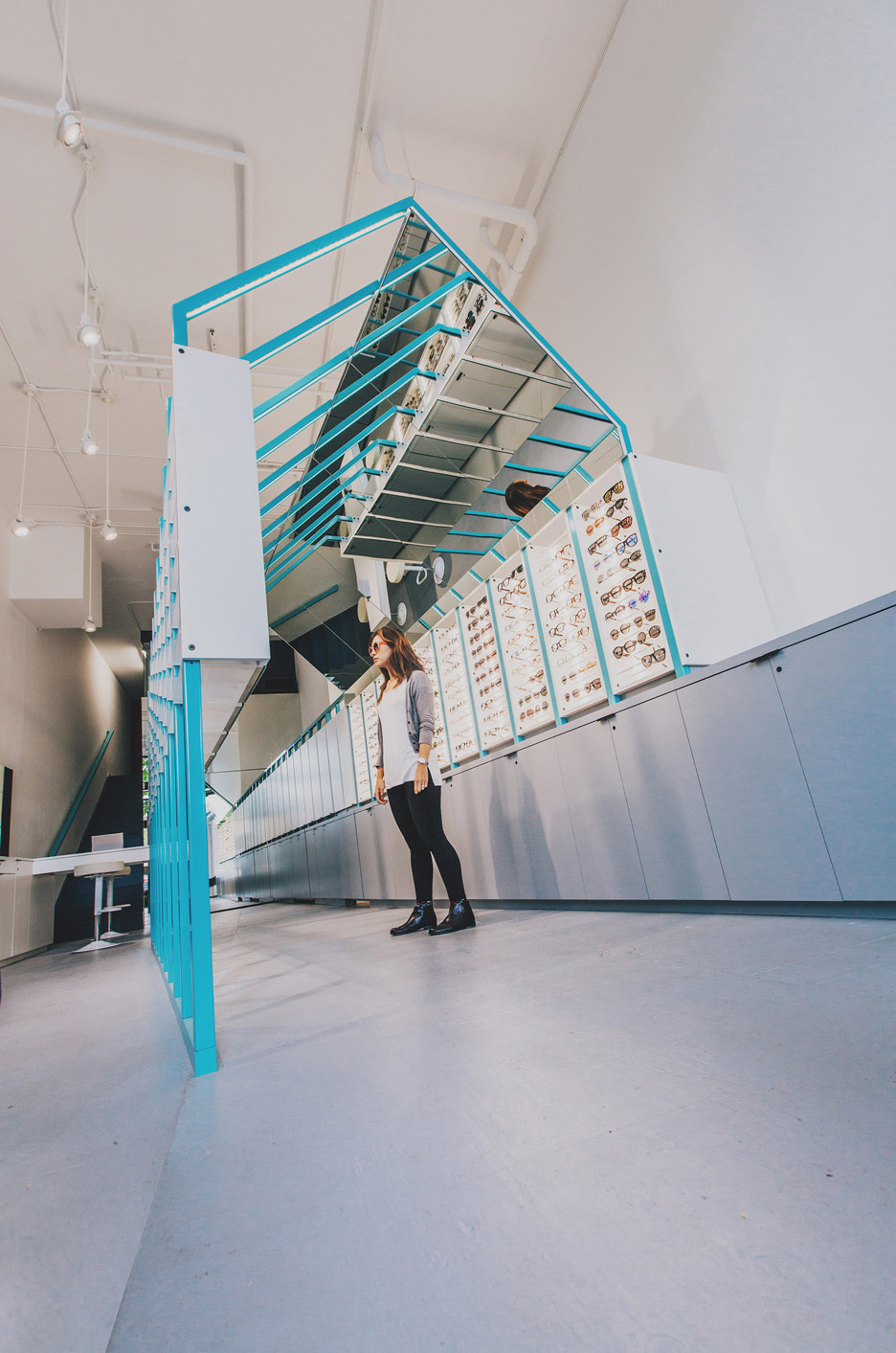
"In order to avoid feeling squeezed in the narrow space, the main path is placed at an angle, creating a different manner to circumnavigating the boutique," said the firm.
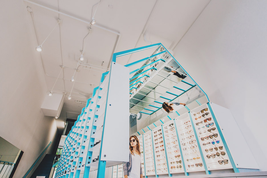
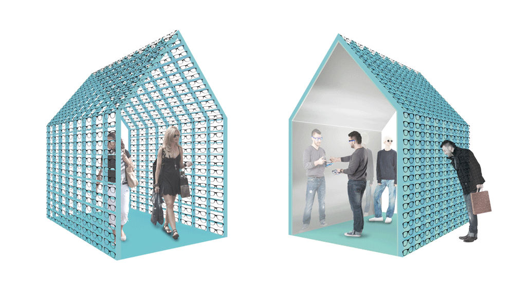
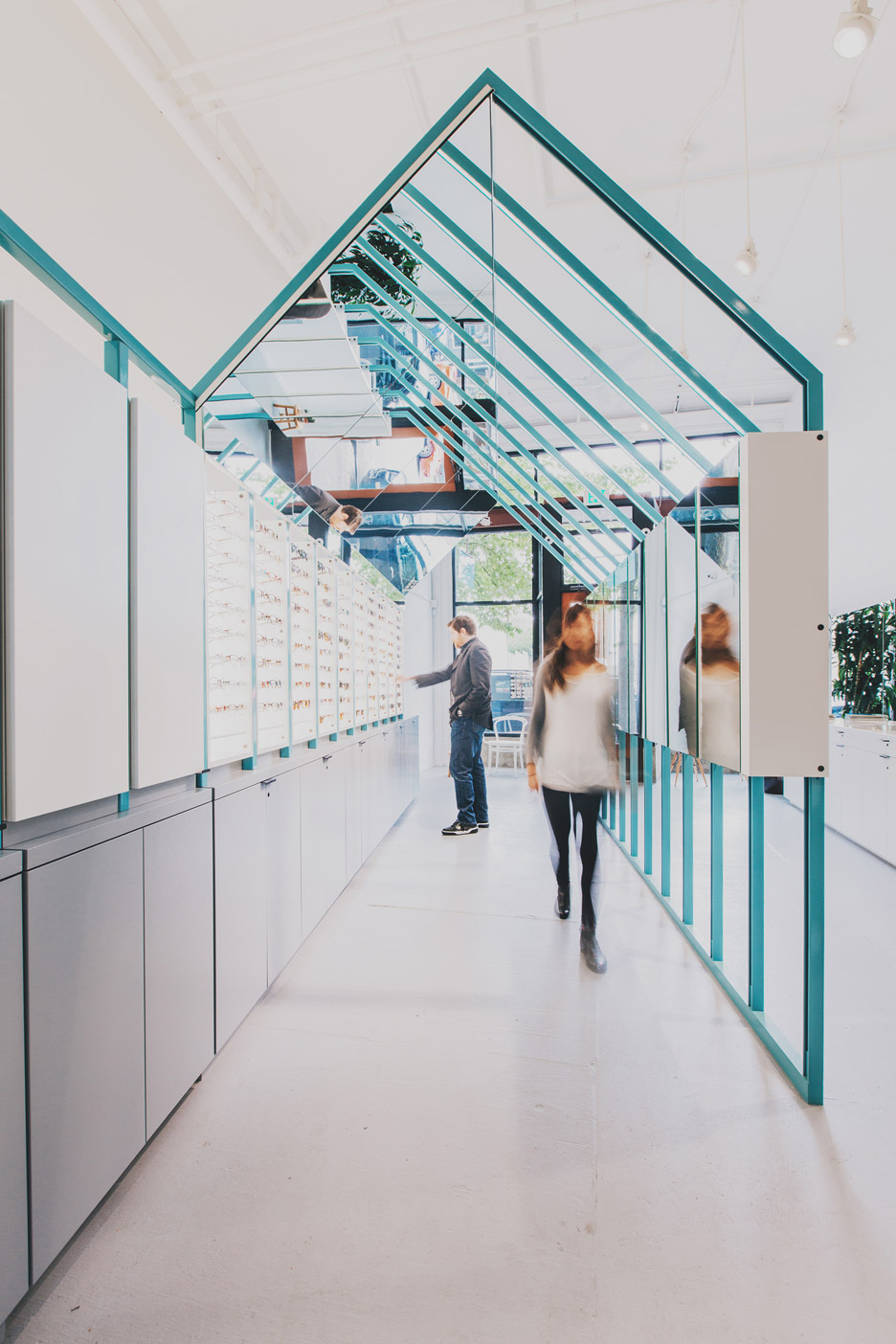
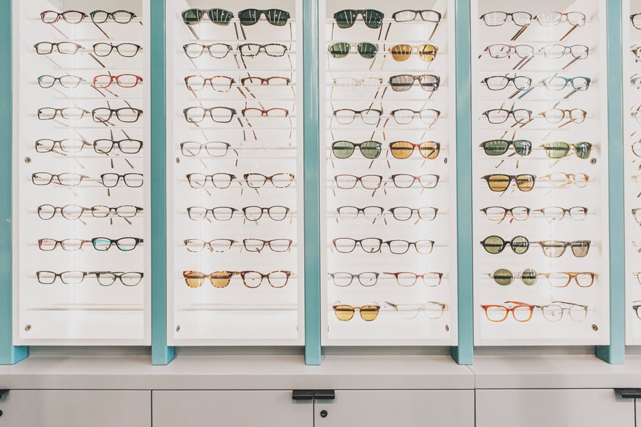
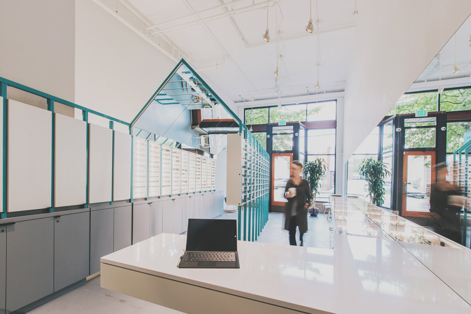
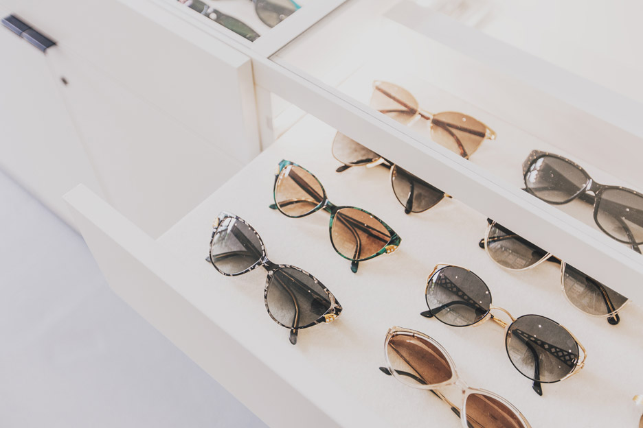
For the retail area, the firm created an enclosure shaped like a house with a gabled roof, with a frame made of blue powder-coated steel. One wall features a band of mirrors, while the other is lined with rows of spectacles.
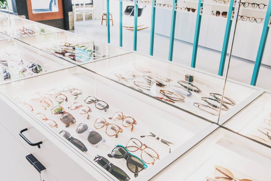
"The shelves have integral lighting that allow the viewer to try on eyewear and see themselves from many angles concurrently in their own private viewing gallery," said the firm.
A sales counter sits outside of the enclosure.
Visitors pass through the retail area and encounter a mirrored wall that "functions much like the lens of your eye, refracting light and focusing it on the retina".
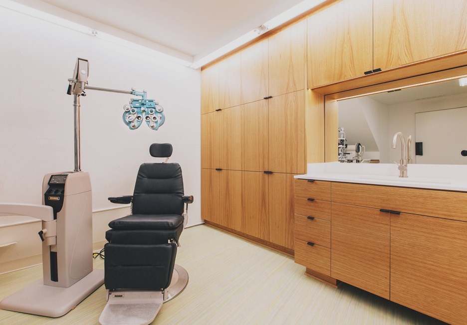
Behind the mirrored wall is the exam room, which is outfitted with white oak cabinetry.
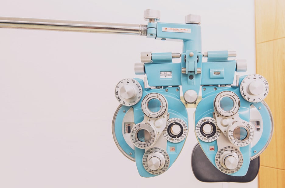
"Intended to be a relief from the more minimal retail zone, the cozy exam room contains a mixture of new and colourful vintage optometry equipment and has space for several different types of testing," said the firm.
Above the exam room is the mezzanine level, which houses the restroom, office and storage area.

The space is designed to be easily dismantled, transported and reassembled, in case the owner decides to relocate.
"The steel frames and cabinetry are all demountable, and can be reassembled easily in a different location, perhaps with a different configuration, with possibilities for new and different reflections," said the firm.
Founded in 2011 by Ian Butcher, Best Practice Architecture works on a variety of projects, from residences to large-scale office projects. It recently completed an upscale shoe store in Seattle in which sneakers are displayed on bleachers.
Other eyewear stores include a Montreal shop by La Shed Architecture that is divided into black and white areas and a shop in Amsterdam by Occult Studio that features pegboard walls.
Photography is by Rafael Soldi.
