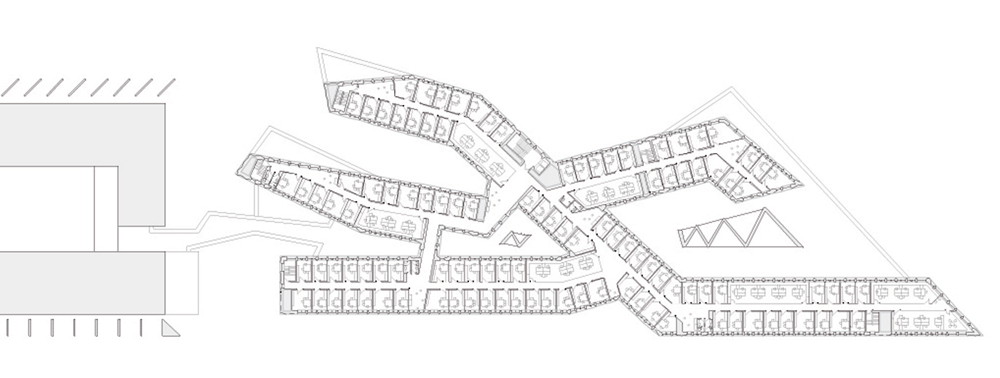
Terracotta panels create zigzagging walls for Madrid university building by Estudio Beldarrain
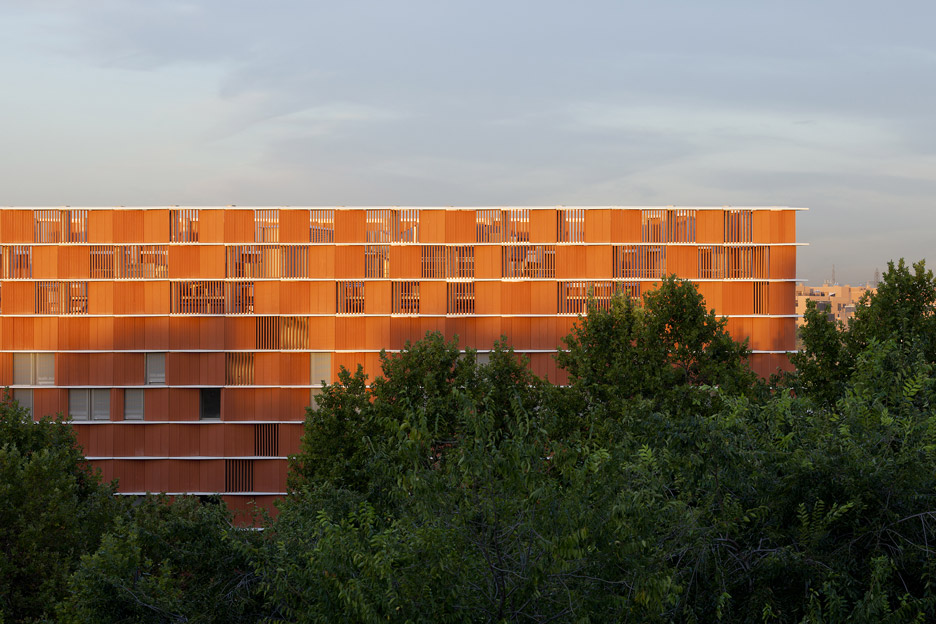
The facades of this university building in the Spanish city of Getafe feature angled bays formed from a zigzagging arrangement of terracotta-hued ceramic panels (+ slideshow).
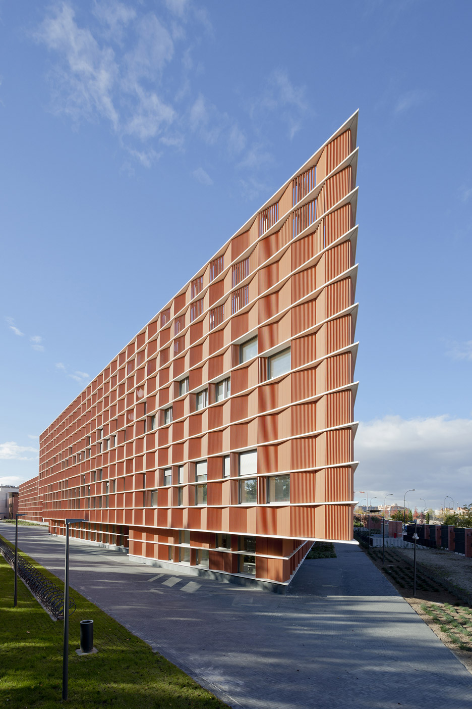
The Carmen Martín Gaite facility was designed by San Sebastián-based Estudio Beldarrain, whose previous projects include an extension to a library with walls made from railway sleepers.
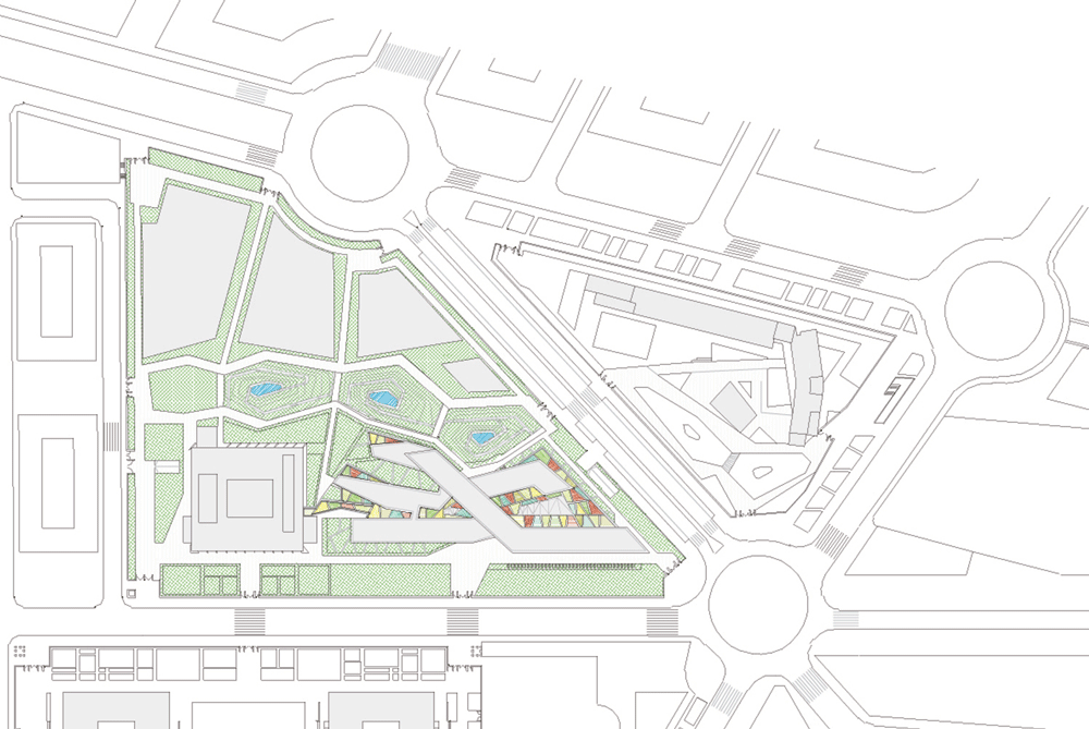
The architecture studio asked to develop two buildings on either side of a park that traverses the campus of the Carlos III University of Madrid.
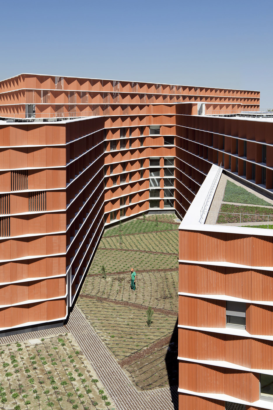
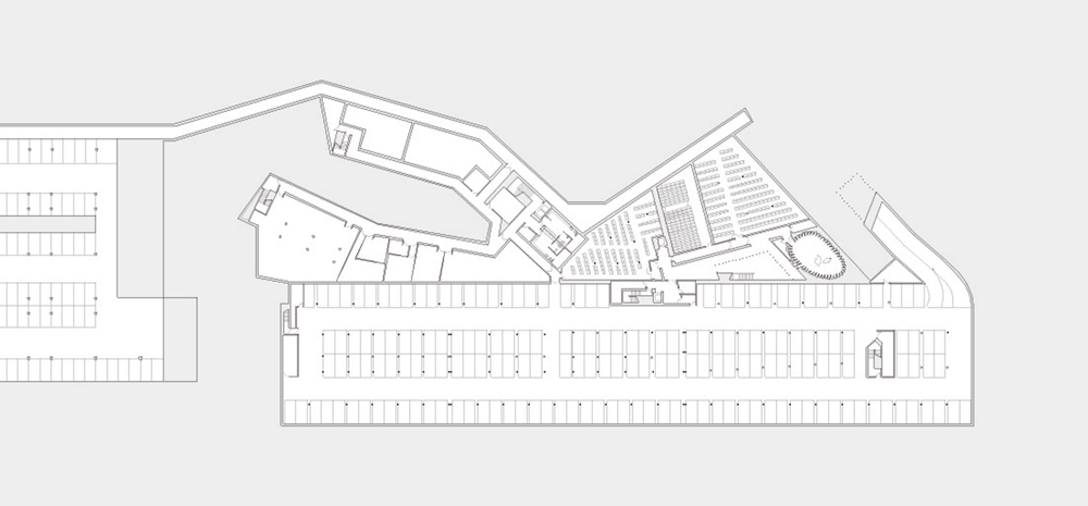
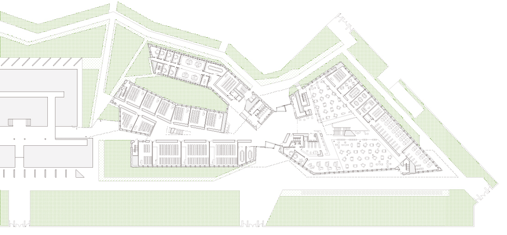
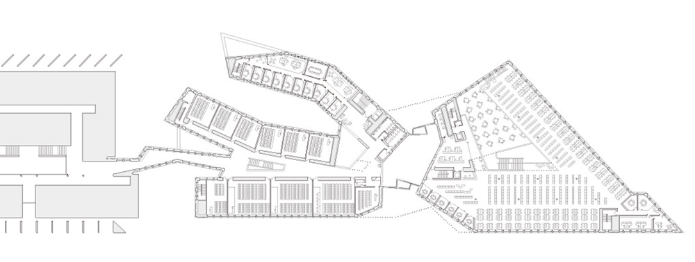
The building's form follows the angular outline of its plot and is made up of a series of wings that extend outwards from a central foyer. This composition results in expansive facades that wrap around several outdoor courtyards and gardens.
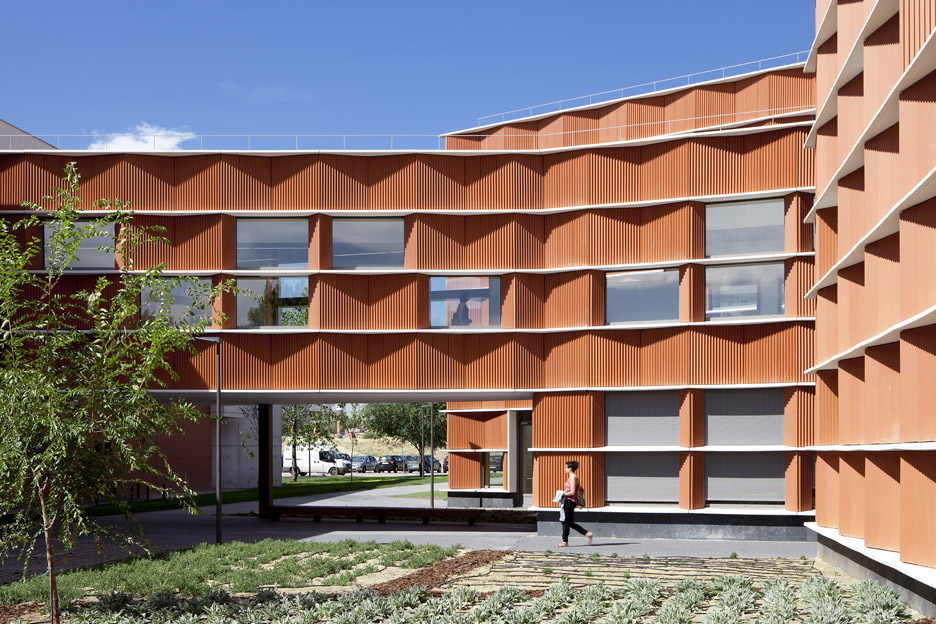
The architects chose a modular construction system to make the building flexible enough to meet the changing needs of staff and students.
The modular approach is particularly evident across the building's facades, where the terracotta-hued ceramic panels are interspersed with windows and louvred ventilation openings.
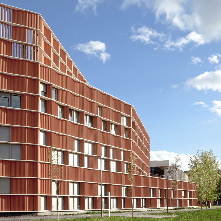
"The process of conceiving the building has constituted a deliberate pendular movement between the confidence in the system and the repetition on the one hand, and the search for exception and diversity on the other hand," said Estudio Beldarrain.
"As opposed to an educational architecture that is traditionally rigid, systematic and repetitive, we take sides for a flexible, diverse and humanised architecture."
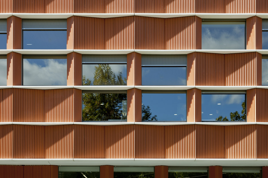
The ceramic sections are angled to form rows of bays that conceal the supporting concrete pillars. The slender post-tensioned concrete slabs are left visible, creating horizontal stripes between the panels.
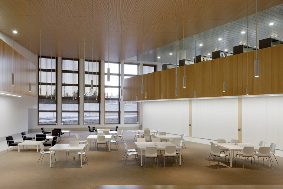
"The bays repeat a well-studied modulation that solves with efficacy the division into big or small lecture rooms and offices," the architects added.
"These bays bend or twist, looking for visual effects, adapting themselves to the surrounding spaces and enhancing the communication spaces."
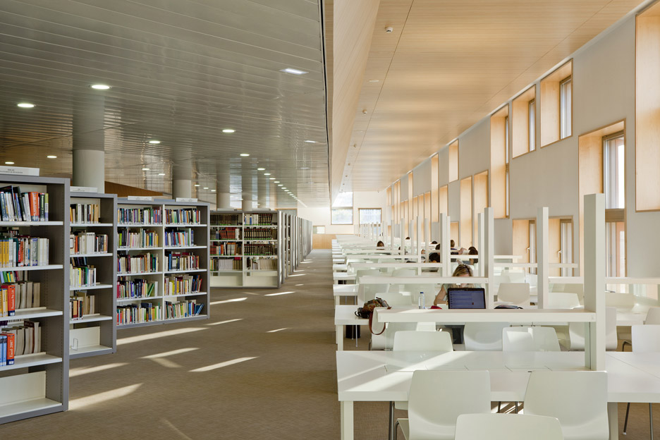
Within the constraints of a restricted material palette and modular construction, the architects used form and the arrangement of the various elements to introduce diversity into the design.
For instance, some portions of the facade also project outwards, above entrances or at the sharply angled corners.
Integration with other existing buildings and with the rest of the campus was key to the design of the extension. The main elevation stretches along the edge of a road and an elevated walkway connects it with the adjacent lecture hall.
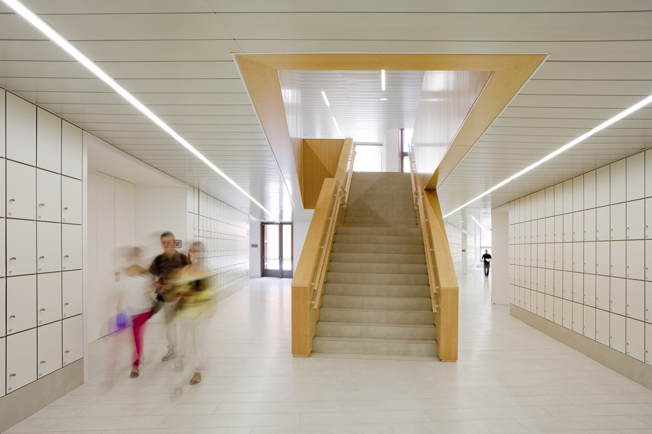
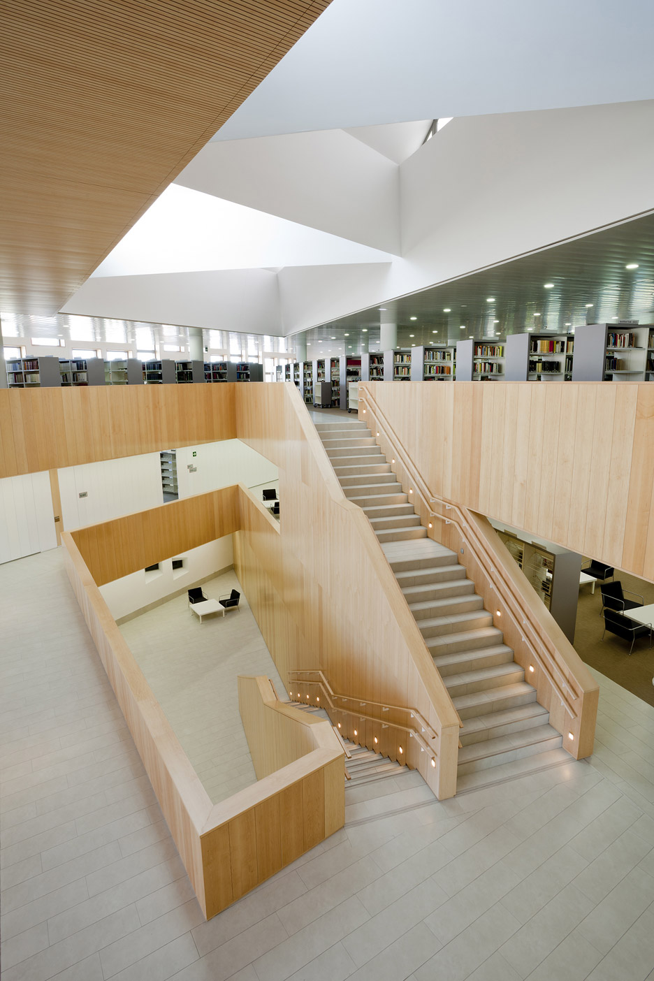
A large foyer at the centre of the facility provides a route between a new park behind and the rest of the campus. A library is situated on one side of this double-height space, with lecture rooms positioned on the side next to the lecture hall building.
The upper storey contains a departmental zone with dozens of small teaching rooms arranged along a series of branching corridors. Gaps between these angular arms accommodate small garden areas that are overlooked by the rooms.
Photography is by Francisco Berreteaga.
