Occult Studio models Ace & Tate eyewear store on contemporary art galleries
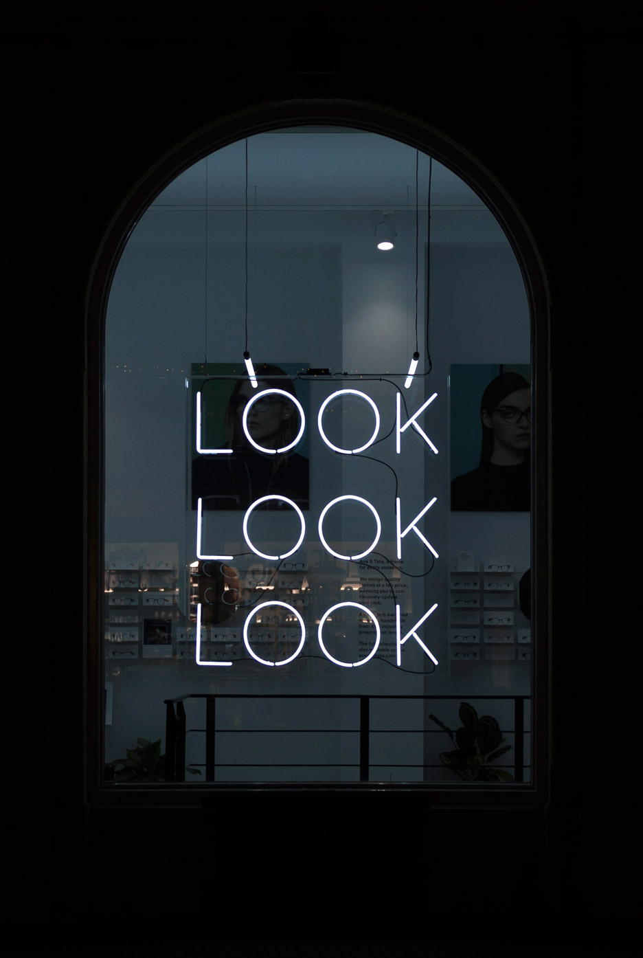
Amsterdam's Occult Studio has based the interior of this eyewear store in Utrecht on minimal exhibition spaces, creating a stage for campaign images and collaborations with artists. (+ slideshow).
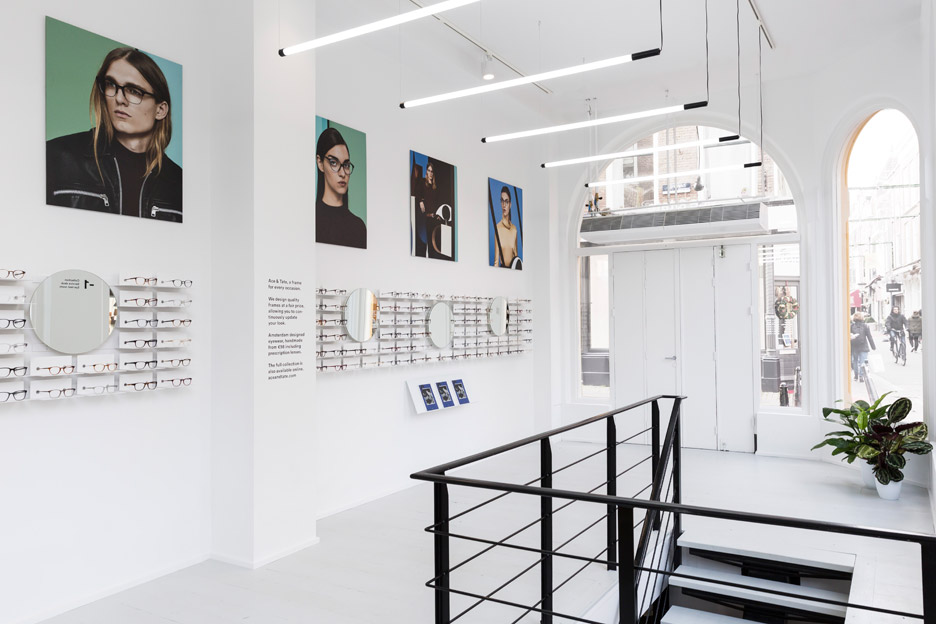
The studio aimed to make a "minimalist statement" with their design, and opted for a combination of white-painted walls and mirrored surfaces.
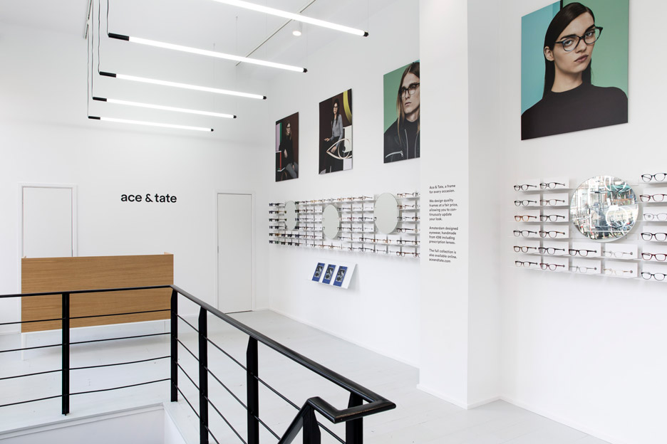
All furniture and accessories in the store are custom-made, including an oak counter and a static grid of tube lights on the ground floor.
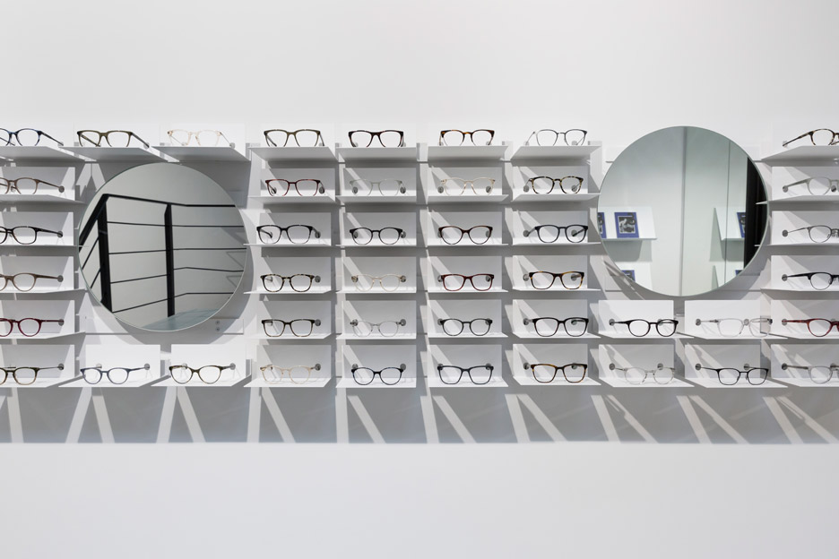
Glasses are displayed on a minimal wall-mounted shelving system by Berlin-based studio New Tendency, combined with Occult Studio's custom round mirrors which are integrated into the display.
"The shelving system acknowledges the products as its central element," said Occult Studio. "We then implemented this system into the overall store design, making it an integrated part of the space."
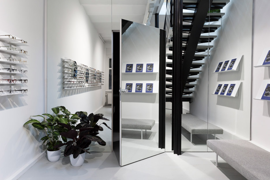
Black steel balustrades fence off a staircase leading down to the basement level, where the studio installed a mirror wall to optically create more space.
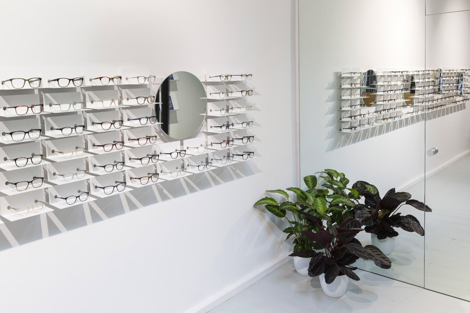
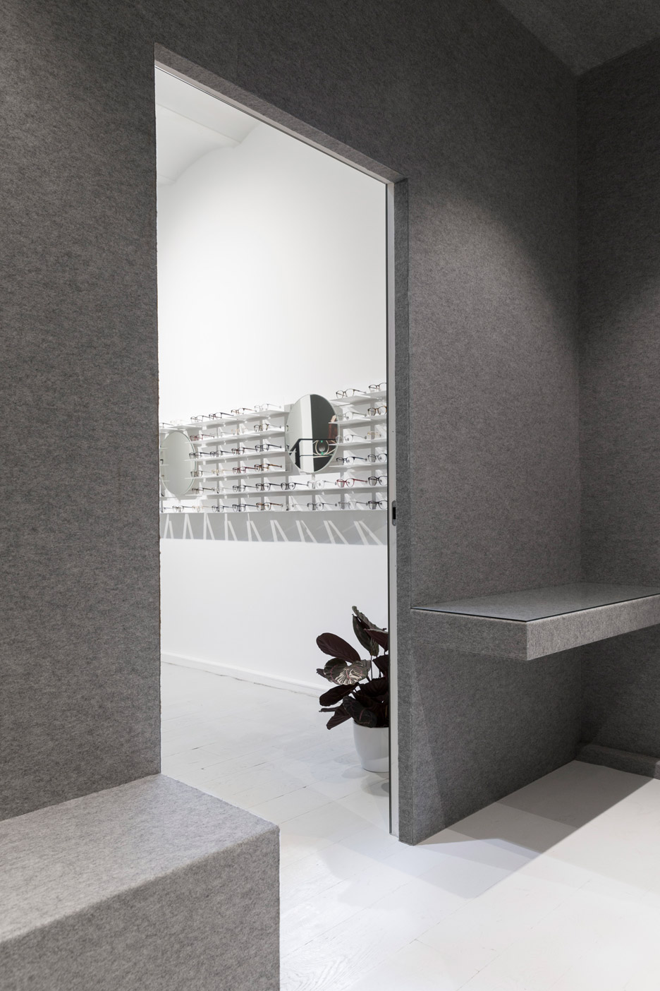
A separate consultation room is hidden behind the mirrored surface. Its walls are completely covered in grey-coloured fabric, which is intended to absorb any noise.
This is the second time Occult Studio has worked with Ace & Tate. The firm previously designed the interior of its first store in Amsterdam, where products are displayed on a peg-hole shelving system.
Other eyewear stores include a Montreal shop by La Shed Architecture that is divided into black and white areas and a Seattle optometrist by local firm Best Practice Architecture featuring a steel-framed enclosure shaped like a house.
Photography is by Sascha Luna Esmail.