Universal Design Studio uses muted colours and brass fittings for J&M Davidson store
Soft tones and metallic details feature across the two floors of this London boutique created by Barber and Osgerby's Universal Design Studio for fashion brand J&M Davidson (+ slideshow).
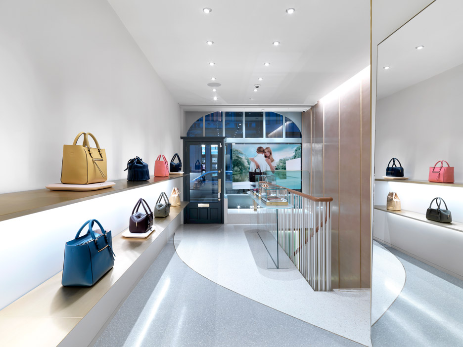
The Mayfair store is J&M Davidson's second retail outlet in London – the other is located in Notting Hill.
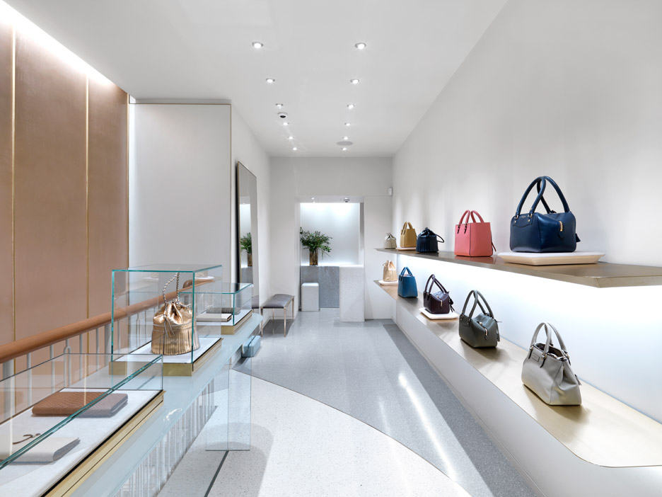
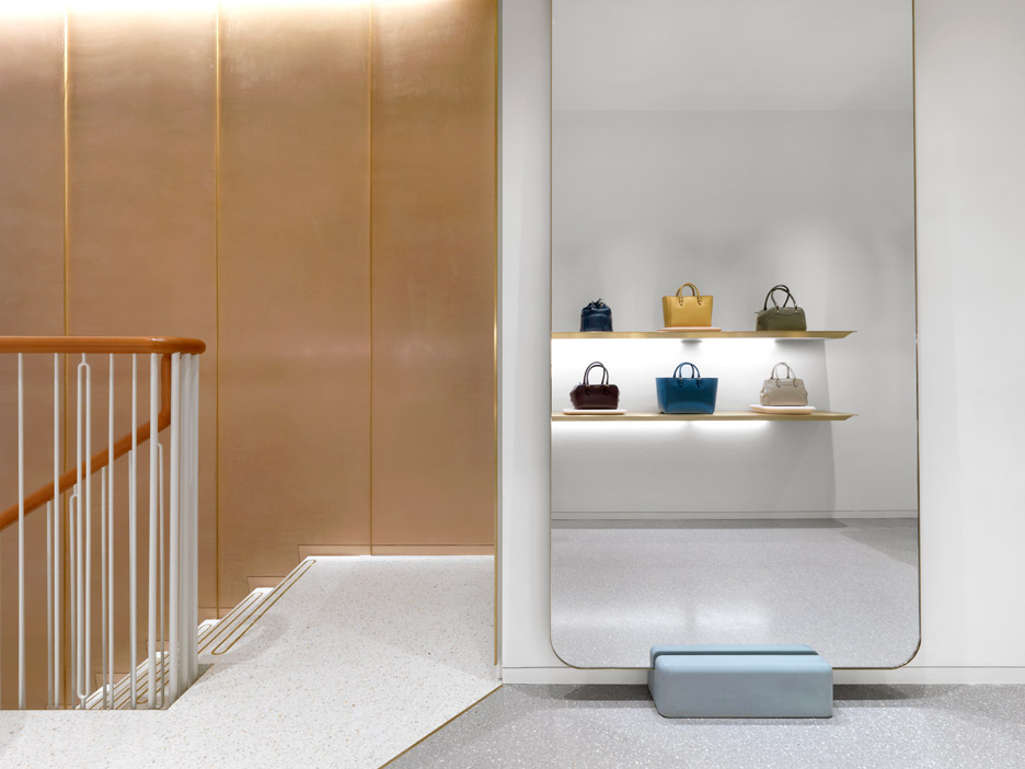
The architects wanted to convey the brand's signature shapes and colour palette through their design, and painted the walls in calming neutral tones of dusty taupes and soft pinks.
"We were keen that the space had a strong dialogue with its place whilst reflecting the brand’s commitment to craftsmanship, quality and attention to detail, expressing the timeless and understated nature of the brand," said Jason Holley, who co-directs Universal Design Studio with Hannah Carter Owers.
The studio was set up design duo Edward Barber and Jay Osgerby in 2001 to focus on architecture and interior projects. Previously, the London-based office has created two pop-up shops for a sportswear manufacturer and a flagship store for clothing brand Reiss.
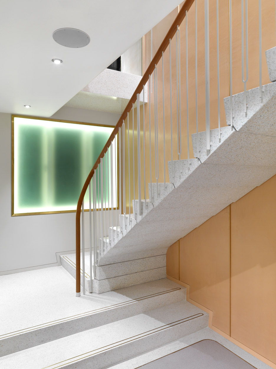
At J&M Davidson, a staircase leading down to a basement level is made with slabs of solid terrazzo marble and features a leather-wrapped handrail.
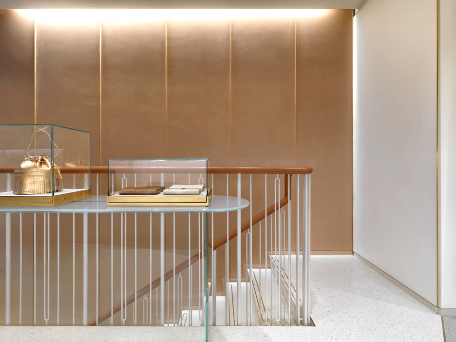
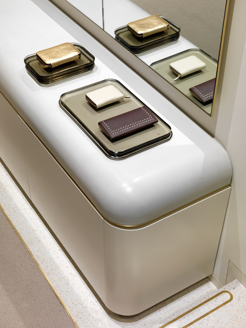
The terrazzo is also used as flooring throughout the store, and is paired with bespoke cast glass plinths and heavy concrete countertops.
Vintage furniture pieces sourced by interior designer Nicholas Chandor contrast with the clean lines and simple materials used to make the display cabinets.
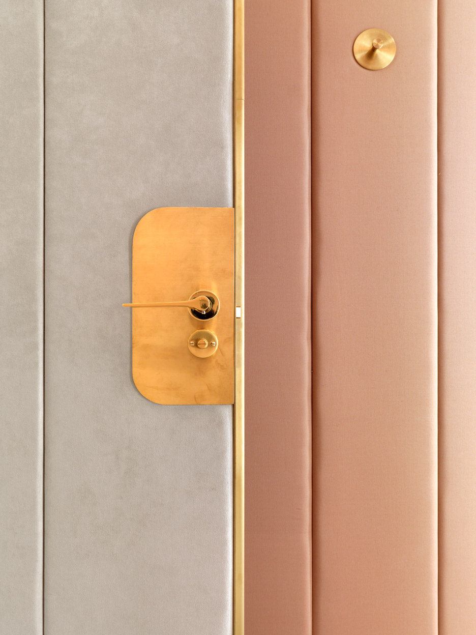
Brushed brass fixtures feature across the store, including clothes rails and wall-mounted lighting.
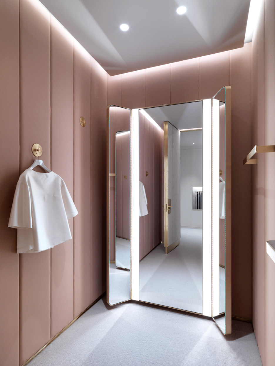
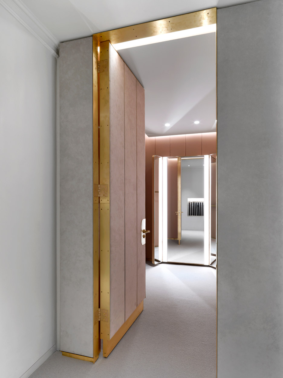
A doorway framed with the same gold-coloured metal conceals a fitting room lined with pink-coloured panels.
Other interesting shop interiors in the UK capital include a Camden jewellery boutique filled with custom-made furniture and tropical plants, and a skincare store with water-covered shelves by local studio JamesPlumb.
Photography is by Charles Hosea.