New York's Metropolitan Museum unveils new logo in advance of satellite Met Breuer opening
The Metropolitan Museum of Art has unveiled a new logo designed by British-American branding firm Wolff Olins in advance of its expansion into the former home of the Whitney Museum, which will be known as the Met Breuer.
The new logo is a stacked version of the words The Met, as the museum is commonly called, with conjoined letters in each word.
The version that has been released shows the new logo in red, but it has also already appeared in white against a red background on promotional material for the Met Breuer.
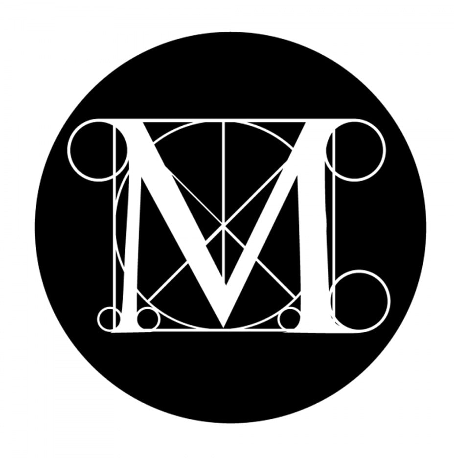
It replaces a logo based on the letter M, surrounded by grids and circles like Leonardo da Vinci's famous drawing of the Vitruvian man, which the institution has used since the 1970s.
In a statement explaining the rationale behind the new design, the museum explained that it is meant to connect more directly with visitors.
"The new logo no longer relies on symbols and, instead, is based on the commonly used name The Met, which has an immediacy that speaks to all audiences," said the museum. "It is an original drawing, a hybrid that combines and connects serif and sans serif, classical and modern letterforms."
"In this respect, it reflects the scope of the museum's collection and the connections that exist within it," the museum added.
Initial reaction to the new logo has been less than positive. New York Magazine's architecture critic Justin Davidson called the design a "graphic misfire," adding that "the whole ensemble looks like a red double-decker bus that has stopped short, shoving the passengers into each other's backs."

"There may be debate about the logo because it involves change, but the museum chose it because it represents something simple, bold, and indisputable: The Met is here for everyone," said the museum.
Wolff Olins, the designer of the stacked logo, previously designed the identity for the Tate art galleries in London as well as the controversial 2012 London Olympics logo.
The Met's new identity will be used on maps, signage, the website, and all other materials representing the museums branches – including the flagship on Fifth Avenue, the Cloisters in Upper Manhattan, which is dedicated medieval art, and the soon-to-open Met Breuer, the new home for Modern and contemporary art, architecture, and design.
The Met Breuer is named for architect Marcel Breuer, who designed the Madison Avenue building that formerly housed the Whitney Museum until that institution decamped downtown to its new Renzo Piano-designed facility, which opened last year.
Dutch graphics studio Experimental Jetset redesigned The Whitney's logo in 2013.
David Chipperfield is currently designing a new addition to the rear of The Met's Fifth Avenue building. The Met is leasing the Breuer building from the Whitney.
Other logos that have recently met a mixed response include the new identity for taxi service Uber, which was compared to an "asshole", and the 2020 Tokyo Olympics branding, which was withdrawn after become involved in a plagiarism case.