High Rise is "not a criticism of post-war architecture" says director Ben Wheatley
The main character in High Rise, a new movie based on JG Ballard's dystopian novel, is a residential tower that "doesn't care about the people inside it" and is designed by an arrogant architect. Director Ben Wheatley spoke exclusively to Dezeen about the film and why it "isn't a takedown of the architects of the 50s and 60s" (+ interview).
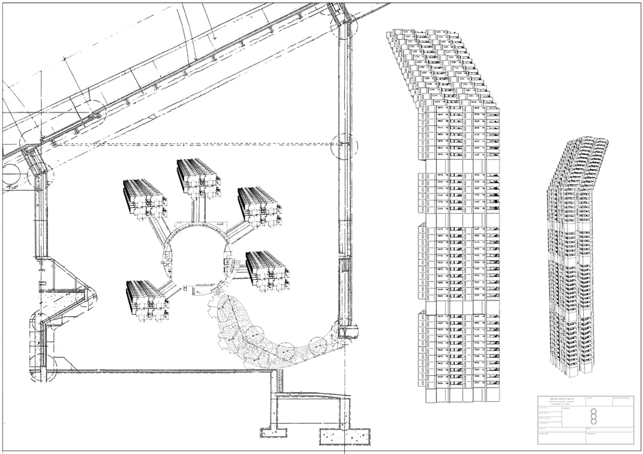
Set on the outskirts of London, the film presents the events that follow the opening of the first of five concrete towers, which are laid out like curled fingers of a hand.
Wheatley, who admitted that he is "slightly prejudiced against tower blocks", collaborated with production designer Mark Tildesley to create the building and its setting.
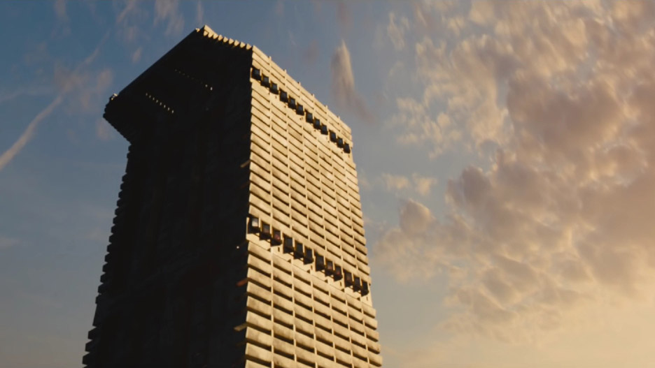
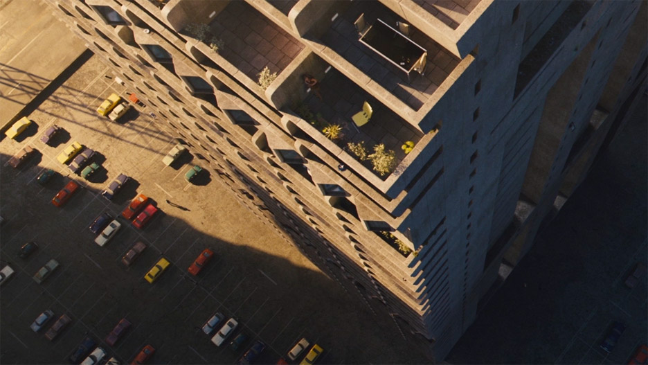
Described by the Architecture Foundation as appearing "jointly inspired by Abalos & Herreros' Torre Woremann in Gran Canaria mixed with Neave Brown's Alexandra Road Estate in Camden", the upper portion of the menacing structure is angled diagonally at the top, so its chunky floors become balconies on one side but cast shadows on the other.
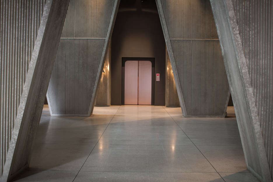
Its interior features thick columns that angle outward from floor to ceiling, imposing on the apartment spaces.
"[Mark] had this image of a triangular buttress shape, and that worked for us in a lot of different ways," Wheatley told Dezeen.
"Because they were kind of upside down, it gave this feeling of impinging on the space of the people, so everything was really oppressive."
The raw concrete aesthetic was based largely on Wheatley's experience of walking through London's tower-block estates as a child in the 1970s, but was also triggered by a particularly bad hotel experience.
"I'd been to a hotel in Denmark where the room had had a pillar in the middle of the room and a load of beams," Wheatley said. "In the architectural plan they had to put these pillars in to make the structure worked but they didn't give a fuck about that room, so someone was going to suffer and it was the poor bastard who had to stay in that room."
"That kind of thinking went in to the rest of the High Rise building – it took no prisoners," he said.
Essex-born Wheatley, 43, began his career as an animator, and short-film and TV director. But he established a reputation as one of the Britain's more unusual filmmakers with gangster film Down Terrace in 2009, 2011's visceral horror film Kill List, and Sightseers, described as a "murderous caravan comedy".
Like much of his previous work, High Rise is a disorienting mix of social commentary, dark comedy, and non-traditional horror, with a narrative that jumps around inside the increasingly sinister building.
The plot loosely follows the middle-class Dr Robert Laing, played by actor Tom Hiddleston, as he moves into the tower.
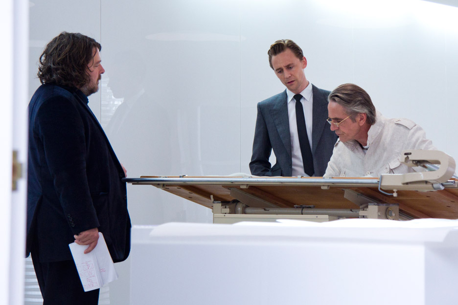
Designed by architect Anthony Royal, played by Jeremy Irons, the floors in the tower are assigned to different social classes, with shared amenities including a swimming pool and a supermarket.
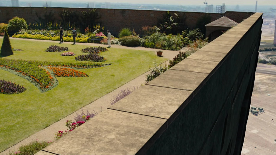
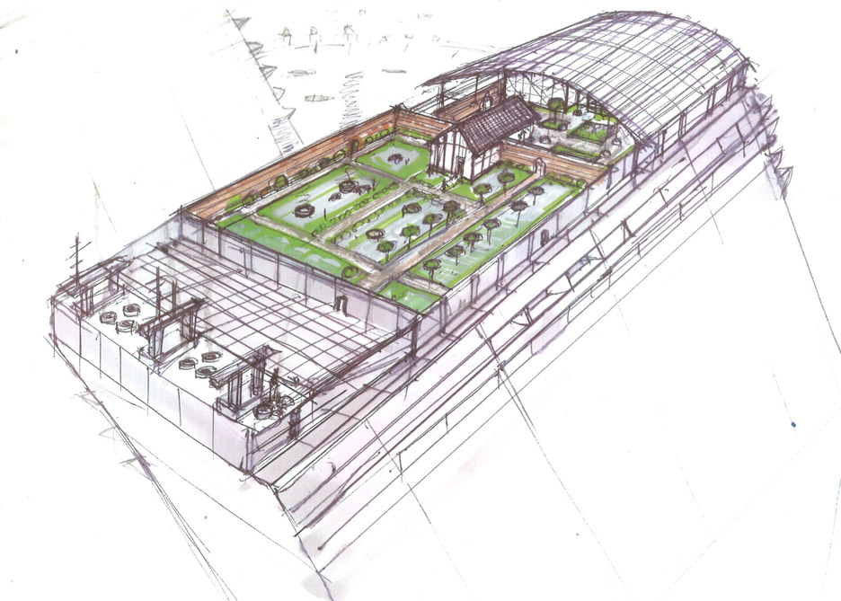
Royal describes his design as being a "crucible for change", but the upper classes still get the top levels. The architect resides in the penthouse – just as Ernő Goldfinger took an apartment at the top of his Brutalist Balfron Tower – and has turned the roof into a garden as a "folly" for his wife.
The building's domineering design and escalating class friction quickly lead to social collapse, with residents engaging in increasingly debauched parties and eventually even eating pets and killing each other.
But the director rejected the suggestion that the set and the egomaniacal architect character Royal were a direct comment on late Modernism.
"The film is not a criticism of post-war architecture," he said. "It's more that the building is a metaphor."
"I think whenever you try to take a god-like view and try to force social stuff on to people and have an overarching idea of how people are going to live, you're opening yourself up for trouble," he said. "Not to say you couldn't get it right, but I wouldn't be surprised when you got it really, really wrong."
High Rise is currently showing at cinemas in the UK, Ireland, Sweden and Belgium. International releases will follow over the next few months.
Read an edited transcript of our interview with Ben Wheatley:
Anna Winston: How do you start approaching the idea of having a building as a key character in a film?
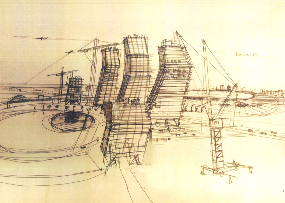
Ben Wheatley: Well, we start with a lot of drawing. I drew a set of storyboards for it, which was about 700 drawings, and then I talked to Mark Tildesley who is the production designer.
He had this image of a triangular buttress shape, and that worked for us in a lot of different ways. One of them was that it was a motif that would tie all the different spaces together in the building.
Then, because they were kind of upside down, it also gave this feeling of impinging on the space of the people, so everything was really oppressive and pushing down on them the whole time. That had come from the idea that the building itself didn't care about the people inside it.
Anna Winston: Was it based on a specific building?
Ben Wheatley: I'd been to a hotel in Denmark where the room had had a pillar in the middle of the room and a load of beams. It was obvious that that room had just been thrown in – in the architectural plan they had to put these pillars in to make the structure work but they didn't give a fuck about that room, so someone was going to suffer and it was the poor bastard who had to stay in that room.
That kind of thinking went in to the rest of the High Rise building – it took no prisoners and it didn't really care about the people in the spaces. Royal, the architect decided that "well, I like the shape of my building and the apartments are almost secondary to the internal structure of the building".
We have more and more of these [buttresses] and by the time we get down to the entrance area you feel like the whole building is pressing down on the people as they come out. The scale of the people is interrupted by the building all the time.
It's kind of the way that churches work, they're meant to make people feel in awe. This is the building almost cross with them that they're in there.
Anna Winston: Did you refer to the book a lot in terms of the design?
Ben Wheatley: There was the description of the development being like a hand and the towers were the fingers of the hand, and the pool wrapped around it like a pond, which was the palm. Once we started drawing it we noticed that having the towers slightly bent looked more like a hand coming out of the ground.
Then we had practical stuff. In the script there's a lot of conversations from balcony to balcony. I'd made a lot of assumptions about that and then I stayed in this hotel in Slovakia, which had a balcony – it was a kind of Brutalist hotel – and I went out on the balcony and looked up and realised that you can't have a conversation from balcony to balcony at all. It would just be little heads poking out so it'd look shit.
The idea for the fingers started to make these sloping balconies, so you could actually interact between them and it would look alright. It's a technical requirement of the script but it then starts to feed in to the aesthetic of how the building looks.
Anna Winston: From the film's point of view, architects and architecture don't come across as very friendly.
Ben Wheatley: The film is not a criticism of post-war architecture. It's not. It's not that detailed when you look at it. It's more that the building is a metaphor.
There wasn't a building that went wrong so badly that the different classes went feral inside it – it's not true, it's not a documentary. It really isn't a takedown of the architects of the 50s and 60s: it's broader than that.
Anna Winston: There's a lot of ideology crammed in to one building, and this very oppressive feeling seems like almost a contradiction.
Ben Wheatley: He's arrogant, Royal. He's just got it quite wrong and he's making a "crucible for change" but he's not sure what it's going to be. He's rolling with it as it happens.
I think that's what's interesting. You get this kind of feeling with people who have put themselves so far above everyone that they think their ideas will out, but Royal hasn't got the intellectual fuel to get to the end of the project.
Anna Winston: Royal is upper class – he's described as an albatross at one point by a "lower level" resident of the building – but the film offers a very nuanced take on class division...
Ben Wheatley: What I like about the book is that he's very slippery, Ballard. You think it's about one thing and then it changes tack very quickly.
When I went back to the book - I read it as a kid and I reread it I was older - I thought "oh it's a book about the working class at the bottom and the upper class at the top and then class war". It just isn't that because the people at the bottom are all working for the BBC, so it's more like lower-middle class, middle class, upper class.
The people start to fight between the bottom, the middle and the top; but then they start fighting between floors and then it breaks completely down in to a more tribal thing and then a more individual thing.
As soon as you think it's one thing - "oh it's just Lord of the Flies" - it suddenly isn't again. It's like having to chase the narrative all the time.
You make assumptions. I made assumptions that Wilder was going to win because he's an archetypal heroic character, he's like John McClane from Die Hard, but then he's not, then he fails. And of course he fails because in reality you can't win.
And then that Royal would out because he's the representative of the elite, but if you put your money on Royal you're betting on the wrong horse again.
Then you'd like to trust Laing because he's a doctor and he's an intelligent guy, you think that he'd be able to work it out. But he turns out to be a horrible moral coward. Trying to navigate your way through that is half the fun of the book.
Anna Winston: At the end, Laing seems to think about himself as almost an amenity, like he feels like he's a part of the building.
Ben Wheatley: Yes, he's like a service and he kind of subsumes himself in to it.
Anna Winston: You've previously talked about trying to find a place to recapture that idea of 70s London being a not-very-nice place to be and having to go to Belfast to find a real-world set.
Ben Wheatley: I wouldn't make that connection though, between 70s London being nasty and Belfast, which is quite the place at the moment.
Anna Winston: In London, a lot of these idealistic towers, like Trellick and Balfron, have been rehabilitated recently – there's a nostalgia about Brutalism.
Ben Wheatley: It's interesting. I went to Vancouver for the first time and stayed in a tower block, with me being slightly prejudiced against tower blocks, and this thing was really beautiful. Everyone lives in these tower blocks, and they're all alright, that kind of condo, and this is seen as the height of luxury.
A lot of it is down to the materials, how buildings have been built, and why they've been built in the first place. When you've got this kind of clearing out of so-called slums and the knocking down of all the Victorian houses, sticking people up in these buildings was almost like a building as medicine, "for your own good", and then people kind of trying to break back out from that.
I think that the gentrification, the kind of rehabilitation of these buildings, is just about money, isn't it? It's more to do with the forcing of anybody who is poor out of London, and then you’re left with these buildings. You can spend loads of money on them and then they're more desirable again. That area has completely changed in character.
Anna Winston: Did that affect your decision to keep the film in the 1970s?
Ben Wheatley: We set it in the 70s because there are elements of the book that would be destroyed by modern life – specifically, social media ruins a lot of stuff. Mobile phones ruined a lot of stuff for thrillers anyway, but social media – the idea that you would report on your life the whole time – kind of buggers a story about a building where people hide away and do whatever they want. These can't exist in the same space.
Also, I felt like the 70s itself was the last moment where there was an optimism, a belief in a future, and it literally stops in 77 with Johnny Rotten saying "there's no future".
Then we're into this kind of Postmodern situation where everything is happening at the same time. I'm not sure whether it's to do with age, but I feel like the 80s is the last decade you can identify by the trousers. But then I spoke to someone the other day who said "no, the 90s is cargo pants".
Anna Winston: Yeah, cargo pants and bumsters.
Ben Wheatley: But isn't that all the time, everywhere? That's 2000.
Anna Winston: The 2000s are skinny jeans, aren't they?
Ben Wheatley: No that's the 70s, and people were wearing skinny jeans in the 80s as well. I'm not sure whether it's just an old-mannish thing where I just don't care anymore so I don't notice what fashion is, or it's that the 2000s just splurge into one big chunk. But 2000 to 2016, it just doesn't seem like there's any difference at all apart from technology. There's no more youth cult stuff.
Anna Winston: Do you feel that it's the same with architecture that there was an optimism in the 70s that isn't there any more?
Ben Wheatley: When you hear people talking about how Zaha Hadid built that BMW factory, I mean that's optimism isn't it? To force the workers and the management to walk together, and the way that the offices have got the production line going through them so they can see when things go wrong, it's very clever. That's a machine isn't it? A living machine.
I think whenever you try to take a god-like view and try to force social stuff on to people and have an overarching idea of how, from your perspective, people are going to live, you're opening yourself up for trouble.
The way that cities organically grow, they grow like that for a reason, through the actual needs of the people rather than being told how to live. Not to say you couldn't get it right, but I wouldn't be surprised when you got it really, really wrong.
