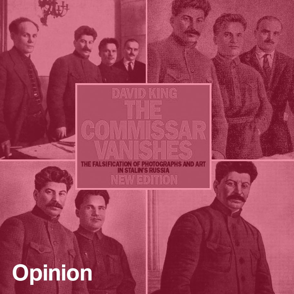
"Hardly any British designers have had a style as instantly recognisable as David King"
Opinion: David King, who died in May at the age of 73, secured a place in British design history with album covers for The Who and Jimi Hendrix, the design of the Sunday Times Magazine, and his logo for the Anti-Nazi League. But his legacy is far richer for anyone interested in the political power of the media, says Owen Hatherley.
Before settling down to write about the graphic designer David King, who died last month, I spread out a few of the books I have that he designed across my table. Most of them are large, glossy photographic albums, roughly the format of the typical photography monograph.
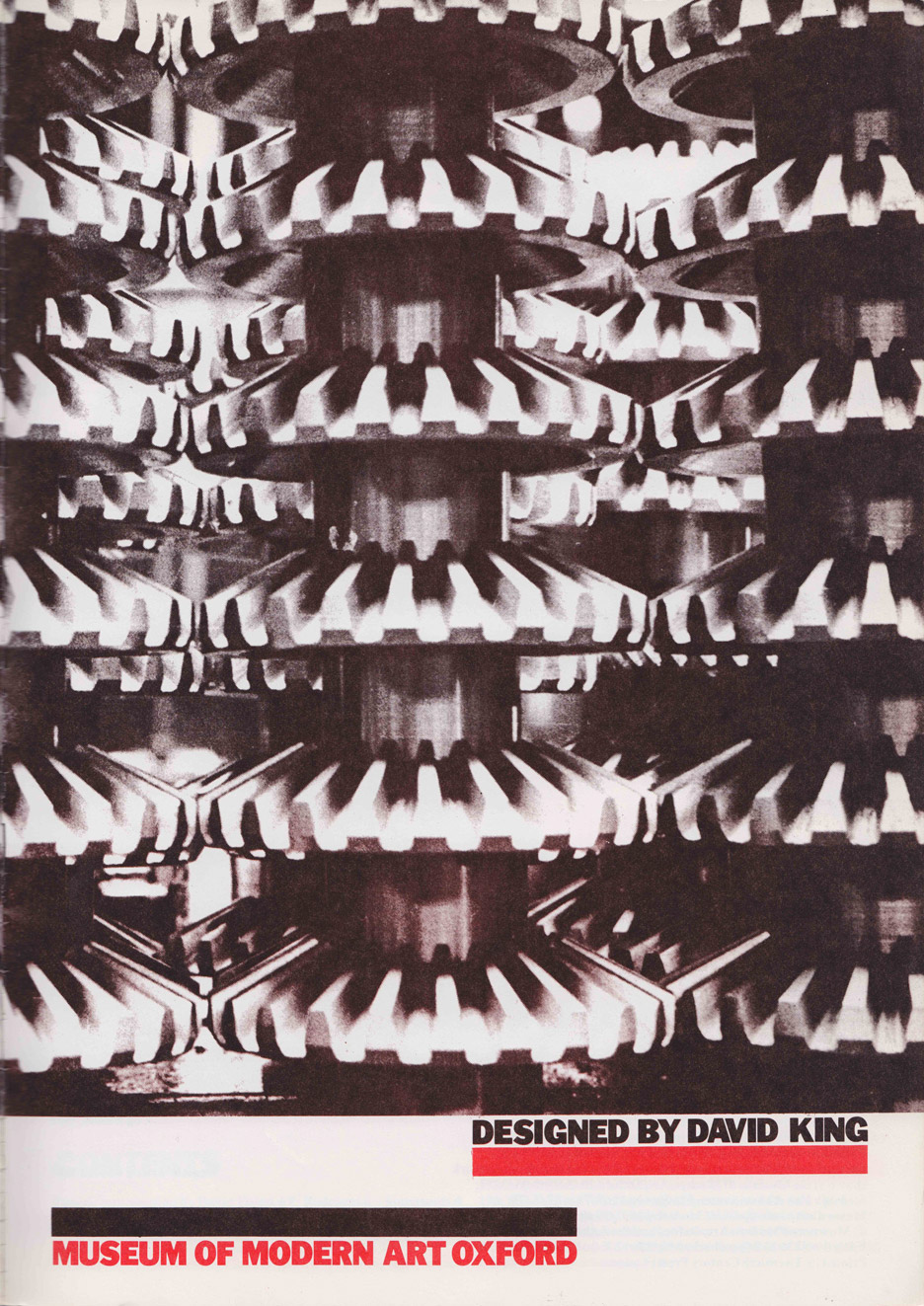
The style of these is consistent, from the mid-1980s up to the mid-2010s. Each has bold, striking sans serifs announcing the title, placed in a box at the centre of the cover, with a colour scheme – red, black, yellow – that would have been arrived at in an era when colour printing was prohibitively expensive, but the dash of red provided by four-colour printing gave drama to the inky page.
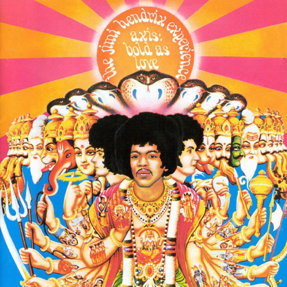
The look was one thing – hardly any British designers have had a style so instantly recognisable – but the contents, especially where the inside had been designed along with the cover, were the point. King used Modernist layouts and typography informed by (but not in hock to) the Constructivist avant-garde of the 1920s, in the service of a unique project: design as history.
Before embarking on this project, King had already established himself a place in the history of British graphic design through two seemingly unalike achievements.
The first was a small series of record covers he designed as a sideline in the mid-1960s, soon after graduating, including The Who's The Who Sell Out, and Jimi Hendrix's Axis: Bold as Love and Electric Ladyland. These were exemplary pop design of the time. The Hendrix covers switched from multicoloured psychedelic mock-Indian whimsy to an allegedly liberating display of "natural" female bodies, while The Who cover was a knowing satire on marketing and advertising itself, with the band members endorsing various corporate products, and Roger Daltrey in a bath of Heinz baked beans.
King became more famous for the design of the first colour supplement for a UK newspaper, the Sunday Times Magazine, from the mid-1960s to the mid-1970s. The photo-reports from war in Vietnam, Cambodia and Northern Ireland, using Don McCullin's photographs, were especially influential on the use of clear, hard imagery in the presentation of war and atrocity.
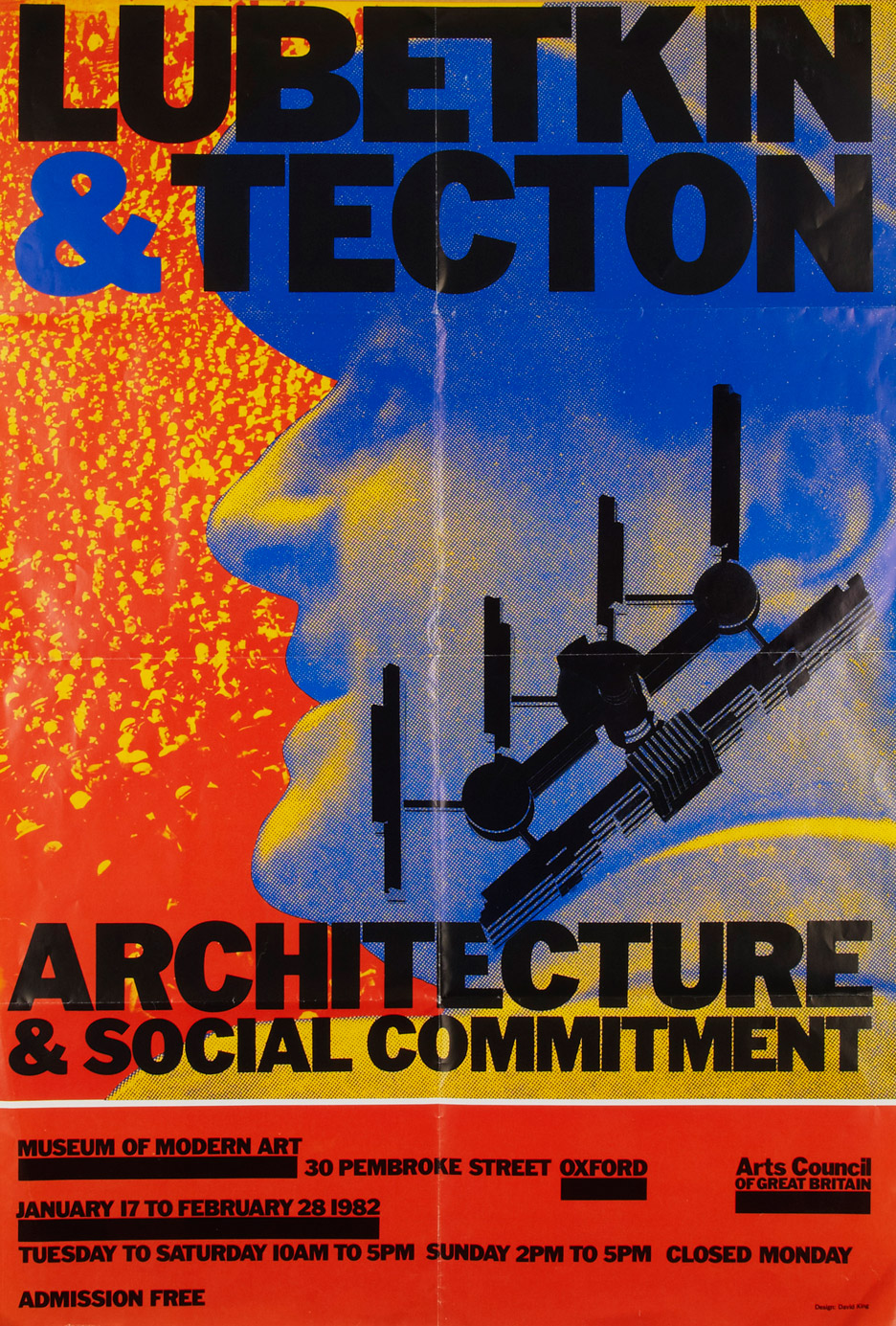
Soon after this, offering his services to anti-fascist and anti-Apartheid political organisations, King helped popularise a Constructivist style as the visual lingua franca of the far left, especially through his dramatic photomontage posters – and arrowhead logo – for the Anti-Nazi League.
But probably more interesting than any of these were the projects he created out of the collection he amassed with his salary from the Sunday Times. Travelling to the Soviet Union from the early 1970s onwards – never a particularly easy thing to do, but particularly then – King gradually amassed a hoard of books, pamphlets, photographs and other ephemera.
This stuff would often be used in his day job. The covers he designed for Penguin's editions of Alexander Solzhenitsyn are especially impressive. For the novella Matroyna's House, a hammer and sickle thumped into the pages of a book – cropped from an anti-illiteracy poster – becomes an unnerving image of censorship.
Most of his research at first related to one historical figure, the exiled and assassinated Communist leader Leon Trotsky. In an era when Trot is still occasionally flung around as a strange, antiquated political insult, the point of this endeavour is easily lost. But King's research was eventually collected in the huge 1986 album Trotsky: A Graphic Documentary, and while on one level it works as a visual life story, it's also a book about the use and abuse of media.
Trotsky goes from a hero of revolution and war, with "as many photographs as Marilyn Monroe", to an unperson, possessions of whose images could land you in a labour camp. The book's layouts and juxtapositions let the media tell their own story.
This is taken much further in the rightly famous The Commissar Vanishes (1997), an astonishing documentation of media manipulation. It was made possible by painstaking picture research, uncovering the originals behind the airbrushed propaganda images of Soviet party leaders in the Stalin era and after. If the tricks of the graphic design trade made this fakery possible, the book attempted to show how these techniques could also reveal how the illusion was constructed.
These two books were elaborate and panoramic, but they were followed by one that was shockingly focused: Ordinary Citizens, a collection solely of mugshots of victims from Stalin's purges.
On explaining why the brutalised subjects of these photographs had such a range of reactions to the camera – anger, horror, resignation, a disturbing irony – King had a technological answer: the low-tech cameras used by the The People's Commission for Internal Affairs (NKVD) had very long exposures, which inadvertently gave their victims time enough to reveal themselves.
In 2000, King offered part of his collection to Tate Modern, which has shown a (constantly changing) room of his ephemera ever since. These exhibitions have in turn been collected in three books, Red Star Over Russia (2009), Russian Revolutionary Posters (2012) and last year's John Heartfield – Laughter is A Devastating Weapon.
Red Star Over Russia could work as a terrific introductory history textbook on its own, were it not more a matter of images rather than text. In one particularly memorable juxtaposition, image and text are in alarming conflict: a beautiful poster promising a Constructivist city of the future is below a text-only banner that warns against "class aliens and hostile elements, degenerates, opportunists, double-dealers, careerists, bureaucrats, self-seekers and morally decayed persons".
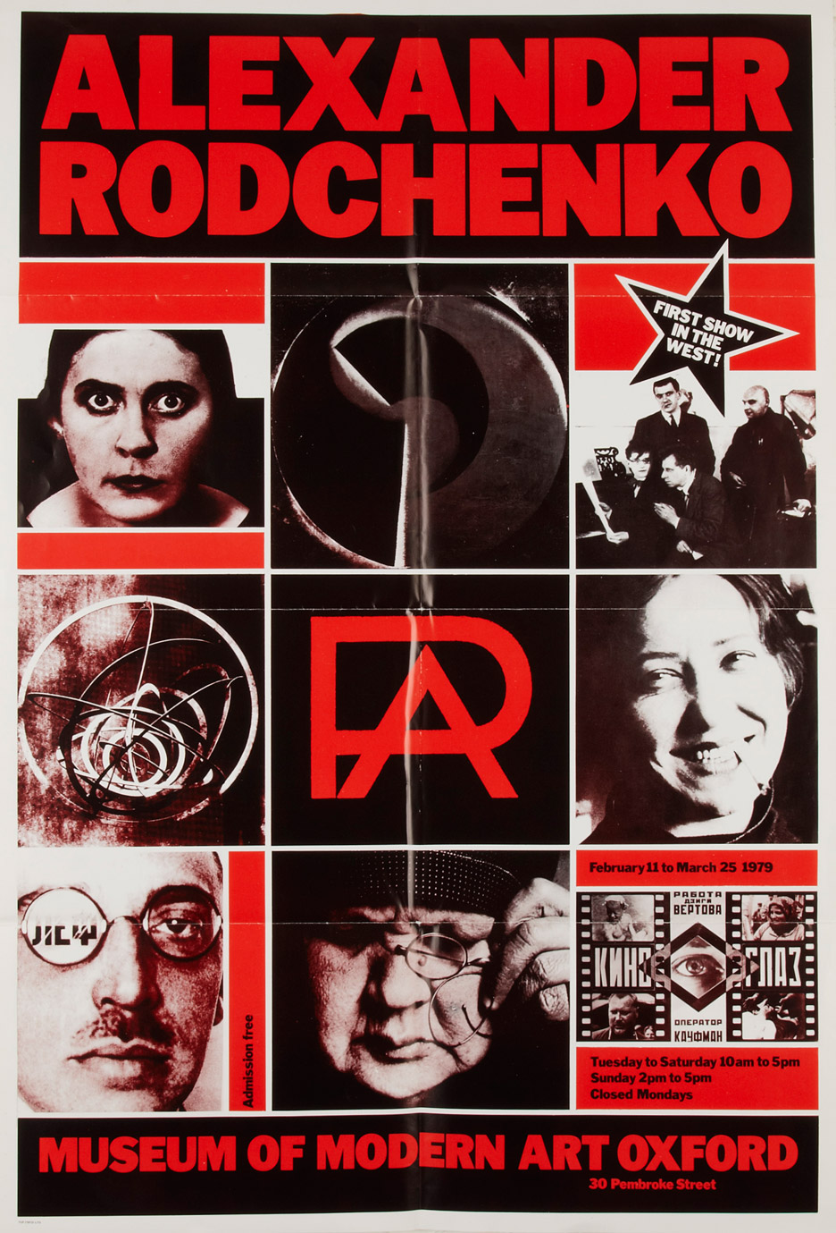
As to what sort of a legacy David King's work will have – as a style, it's very easily parodied, and has been for some time. In Britain, any given demonstration for some decades has been full of sub-King bars and blocky fonts, as if nothing has changed since 1977.
More interestingly, contemporary designers like Metahaven or Societe Realiste owe much to his approach to using graphic design as a tool for political protest and/or historical investigation.
It's telling that King's last book, on John Heartfield, was about someone whose best work was dedicated to wielding design as a tool for ruthless, hilarious mockery of the pomposities of fascism. In the next few years, we may need much more of that.
Owen Hatherley is a critic and author, focusing on architecture, politics and culture. His books include Militant Modernism (2009), A Guide to the New Ruins of Great Britain (2010), A New Kind of Bleak: Journeys Through Urban Britain (2012) and The Ministry of Nostalgia (2016).