Rio 2016 motif is "first 3D logo in the history of the Olympics" says designer
Rio 2016: producing an Olympics logo is the world's hardest graphic design challenge says Fred Gelli, who created the identity for this year's summer games in Rio de Janeiro.
The Brazilian graphic designer developed a three-dimensional logo for Rio 2016, which depicts three colourful figures holding hands and linking feet.
"It's the first 3D logo in the history of the Olympics," said Gelli during a talk at the Design Indaba conference earlier this year.
He said the complications of scaling the branding for all its potential uses made the task a huge challenge.
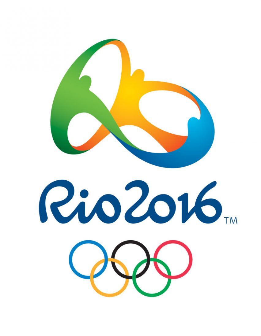
"It's considered the most complex visual identity in the world because it has to be printed on a pen and at the same time it has to dress the whole city," said Gelli.
Gelli's design agency Tátil, which he founded in 1988, was one of 139 that attended the initial briefing for the Rio 2016 logo competition.
"When I saw I thought oh my God, I'm going to give up!" he said.
Each was told that their proposals had to incorporate 12 different attributes – from reflecting local culture to being universally understood. It had to be as effective "printed on a billboard in Fifth Avenue and at the same time on a newspaper read in a small village in the Himalayas," said Gelli.
"Our target was really the entire world," he added.
After hearing they had won the competition in September 2009, Gelli and a small team had to keep the news and design development completely secret for four months.
"We created this room, NASA, with digital keypads so only certain people could go inside, without internet," he explained.
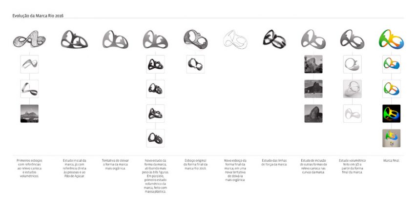
They created over 50 iterations of the Olympics logo. But Gelli said that only one design fused all 12 attributes that the brief required.
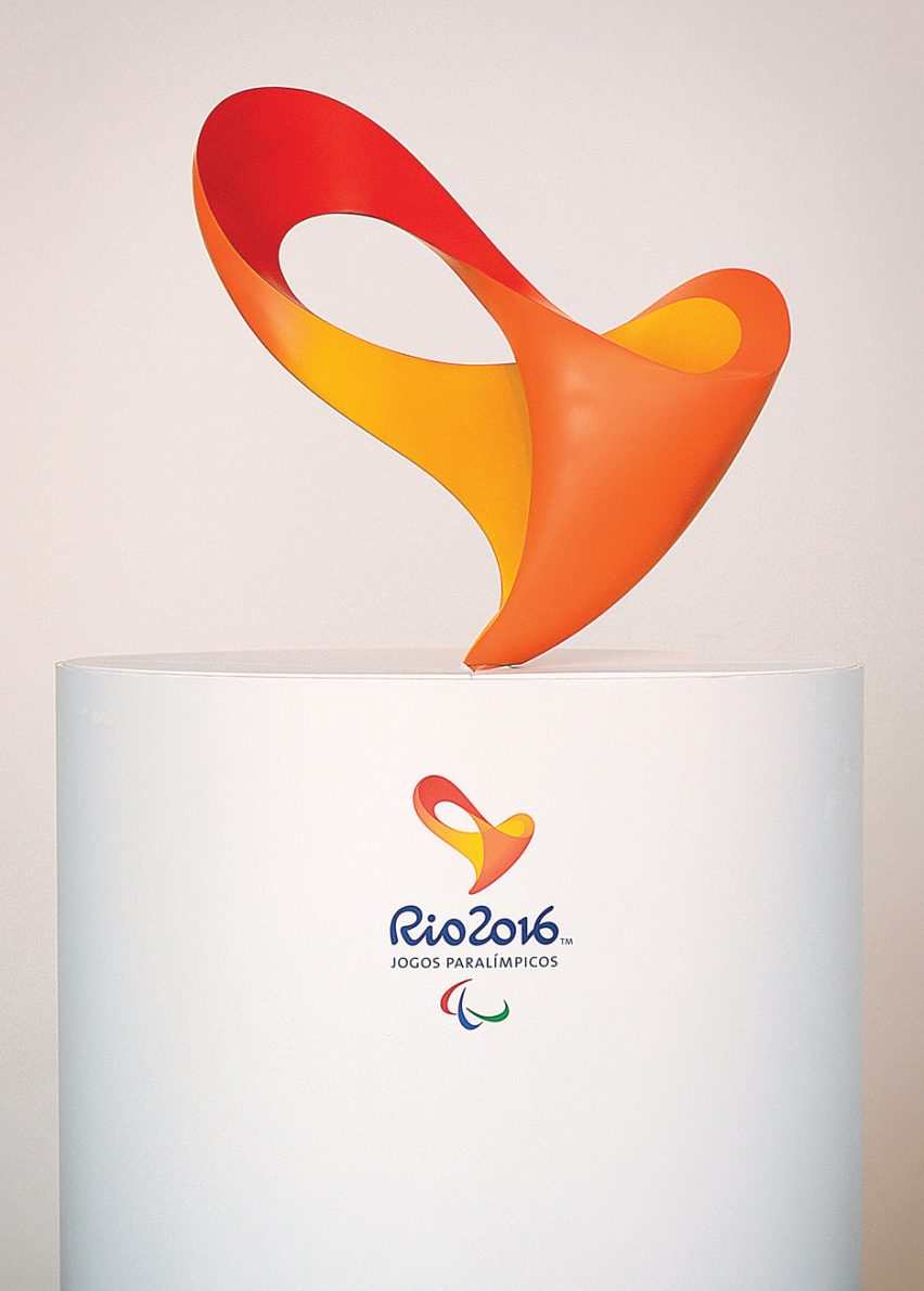
The end result was produced as a three-dimensional digital model.
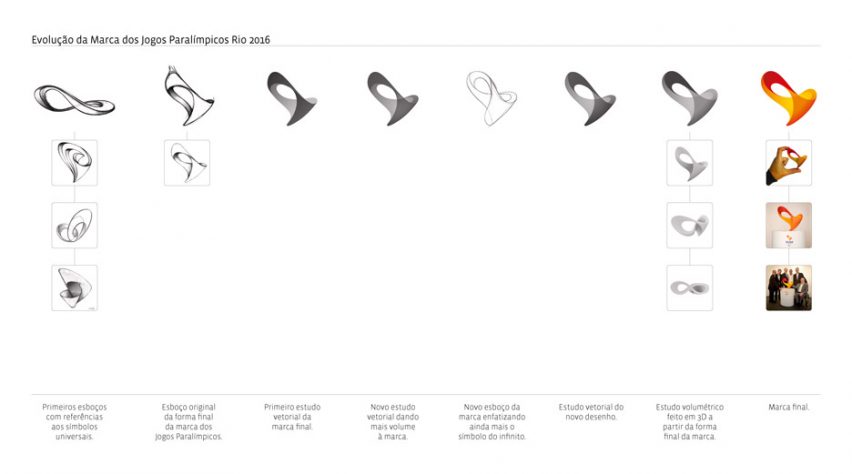
Along with Tátil's logo for the Paralympics, which was created in a similar way, the logo can be animated so the figures spin around each other when viewed on a screen. Both can also be created as physical 3D models.
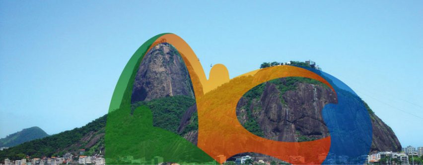
"All the other parts are inspired by the shapes of Rio de Janeiro's mountains, the Sugarloaf etc," he added. "It's amazing that people really love the logo."
Among its fans is graphic design legend Milton Glaser, who ranked it highly in his list of the best and worst Olympic logos since 1924.
Olympics logos often prove controversial with both critics and the public. Wolff Olins' design for London 2012 was slammed by critics, including Alice Rawsthorn, and had to be taken down from the official website over fears it could trigger epilepsy.
The Tokyo 2020 games has already had problems with its visual identity. The designer of its first iteration was accused of plagiarising the motif from a Belgian theatre, so a public competition was held to find a new logo.
This year's Design Indaba took place in Cape Town from 17 to 19 February 2016.