Messana O'Rorke uses wood, marble and concrete for Malin+Goetz's US stores
New York studio Messana O'Rorke has completed three new boutiques for the high-end skincare brand Malin+Goetz in the USA, each of which features a different look (+ slideshow).
Malin+Goetz commissioned the studio to design stores for New York City, Los Angeles and Santa Monica.
Each shop was created within an existing retail shell and employs different strategies for the display of the brand's upscale products for hair, skin and face, as well as a line of candles and fragrance items.
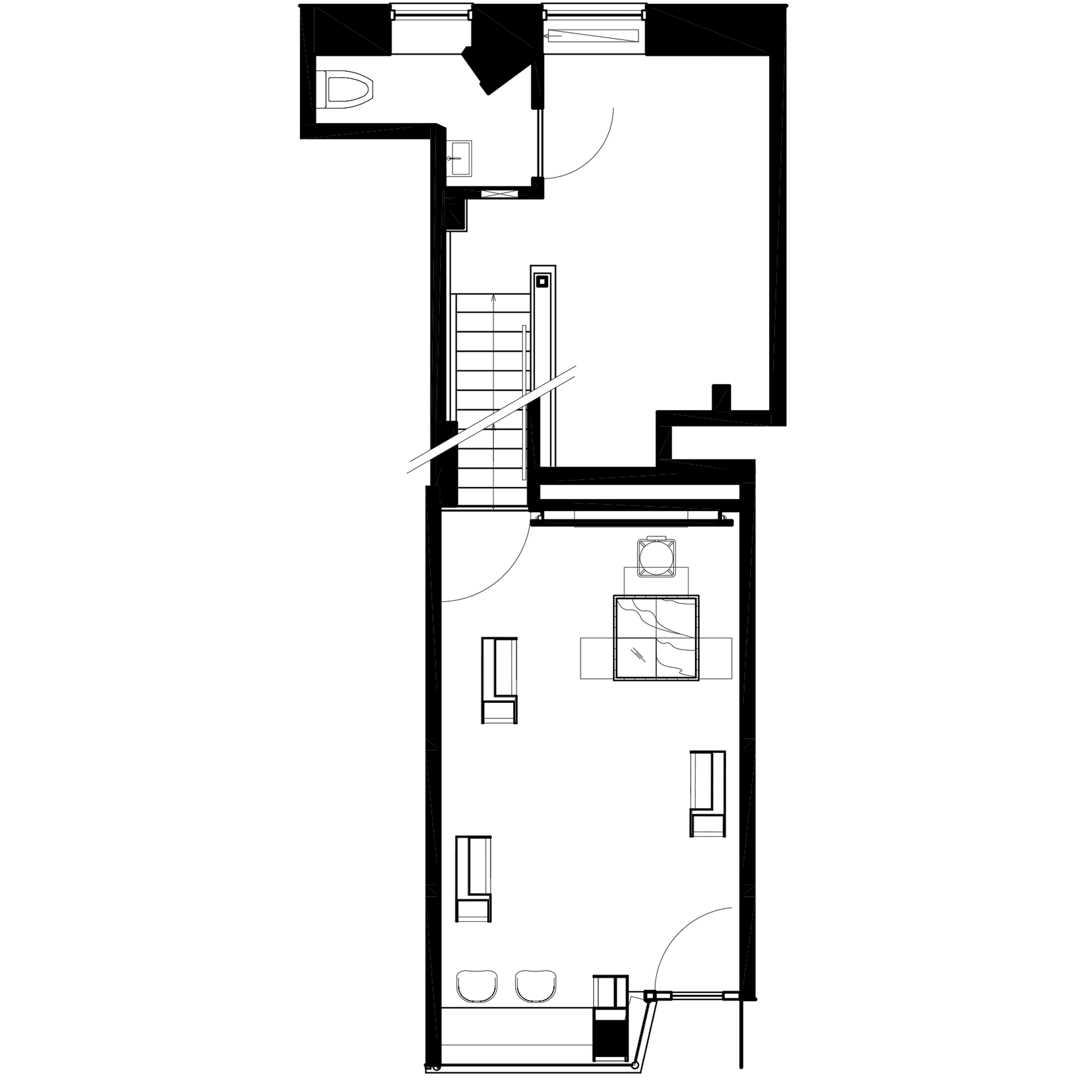
For the brand's third store in New York City, the architects drew references from the urban landscape and Minimalist artwork.
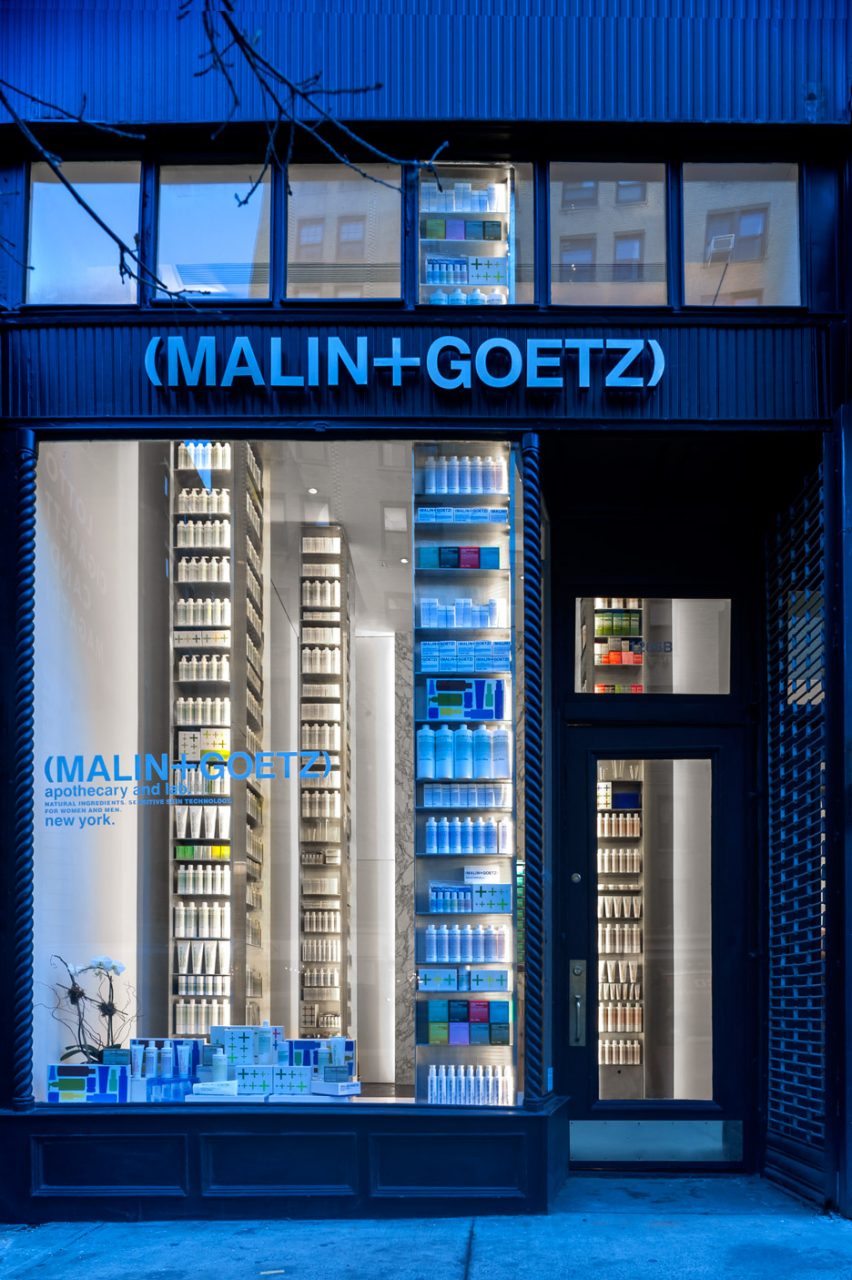
Located in the Upper East Side neighbourhood, the black storefront features ample glazing, enabling clear views into the boutique.
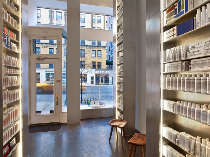
The space formerly housed a dry-cleaner and had a mezzanine that the team demolished, resulting in 16-foot-high (4.8-metre) ceilings.
The architect inserted four aluminium shelving units that extend to the ceiling – their height a reference to the skyscrapers that populate Manhattan. The units are fully stocked with the brand's products, known for their distinctive white packaging.
"The dynamic tension between the small floor area and the monumentality of the freestanding shelving units reflects the New York City urban environment," said Messana O'Rorke, a studio founded in 1996 by Brian Messana and Toby O'Rorke.
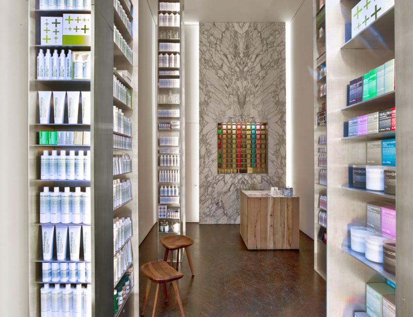
"Our influence, among other things, was the triplet of I M Pei's Silver Towers," the studio said, citing a trio of 1960s Brutalist-style towers by the Chinese-American architect in Greenwich Village.
Other interior elements include a "human-scale" point-of-sale counter fashioned from reclaimed oak, and a marble wall with grey veins and built-in pigeon holes. The chevron-patterned floor is made of dark-stained wood.
The modern finishes were inspired by the work of Minimalist artist Donald Judd, according to the studio.
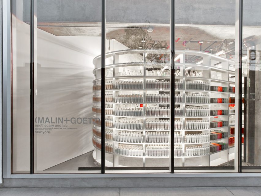
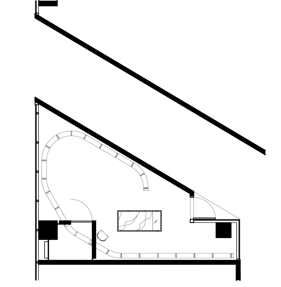
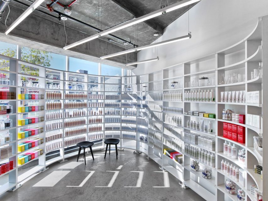
In Los Angeles, the architect took a different approach, creating a space that features a curving white display unit that weaves through the store.
The shop is housed in a 1,000-square-foot, wedge-shaped space that initially presented some challenges. When first surveyed, "it was not immediately clear how to develop a store, or indeed how to access it," the architect said, noting that the space could only be entered through a neighbouring shop.
Given LA's lack of pedestrian traffic, the architect decided to orient the store toward a courtyard, where a mall is expected to be constructed. The main entrance is located on this facade, while a window display was created on the street-facing side.
For the display of products, the architect inserted a tall serpentine form that curves through the boutique. "The fixture developed as an idea of a single ribbon structure, reminiscent of that perfect moment when a new concrete building is just floors and columns," the architect said.
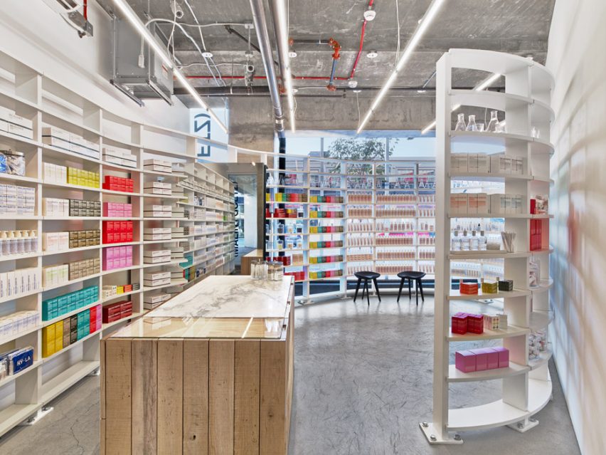
Each bay in the unit contains 10 shelves, which are held in place by a single floor-anchored column.
The store's walls are sheathed in white plaster while the floor is made of concrete. A mirrored partition juts into the space and forms a small storage area.
The sales counter was fabricated using marble and reclaimed oak.
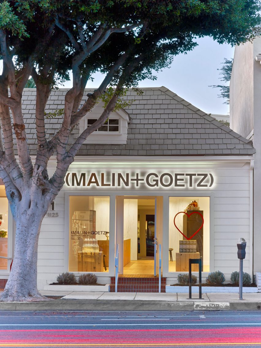
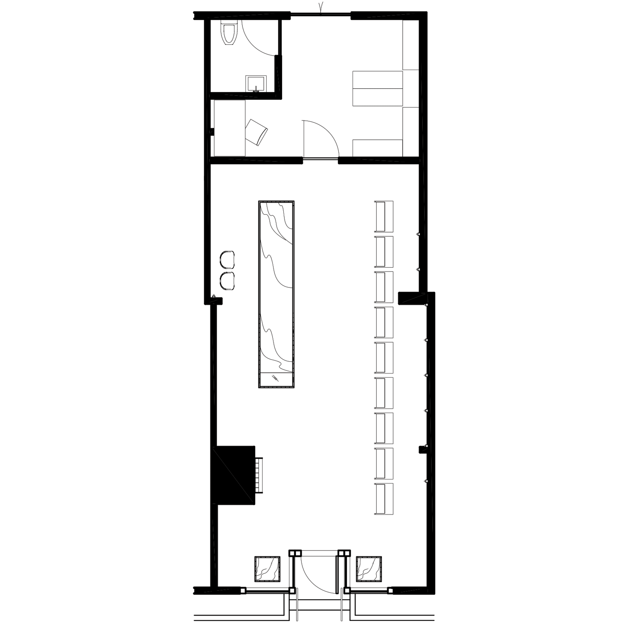
The third store by Messana O'Rorke is located in Santa Monica, a beachside city west of Downtown Los Angeles. The team was charged with converting a former pet grooming salon in a cottage-like building into a modern-style store.
"The semi-detached 'retail cottage' oozed LA-style old world charm and presented about three times more space than necessary to retail the M+G product lines," the architect said.
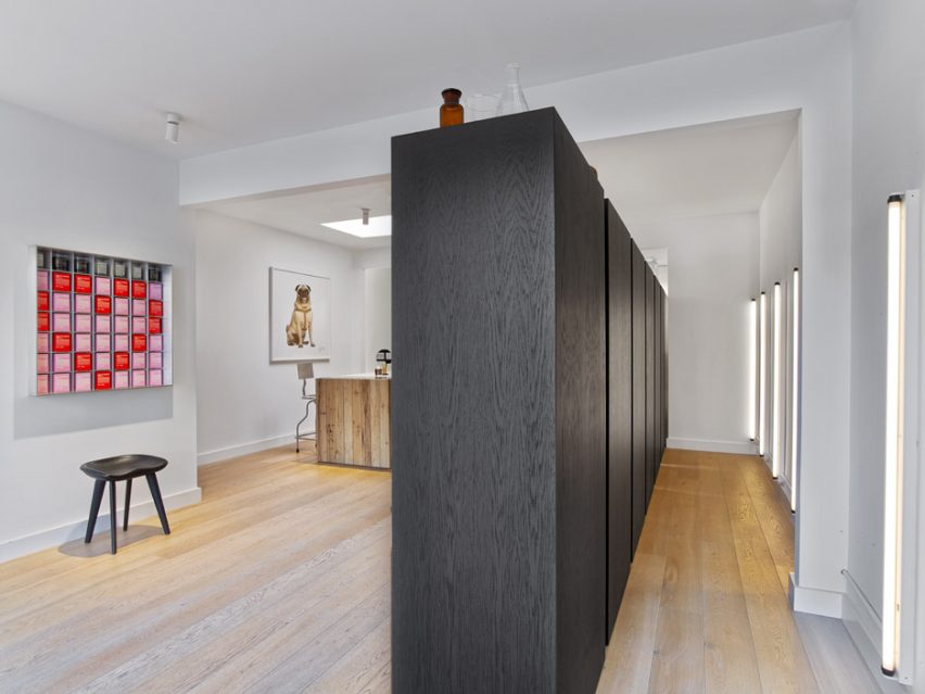
Due to local regulations, the architect could only do a cosmetic intervention that did not "decimate" the original aesthetic.
The retail space was reduced by a third through the insertion of a marble wall. Behind the wall is an area containing an office, staff facilities and storage. The existing walls were cleaned up, and a new oak floor was installed.
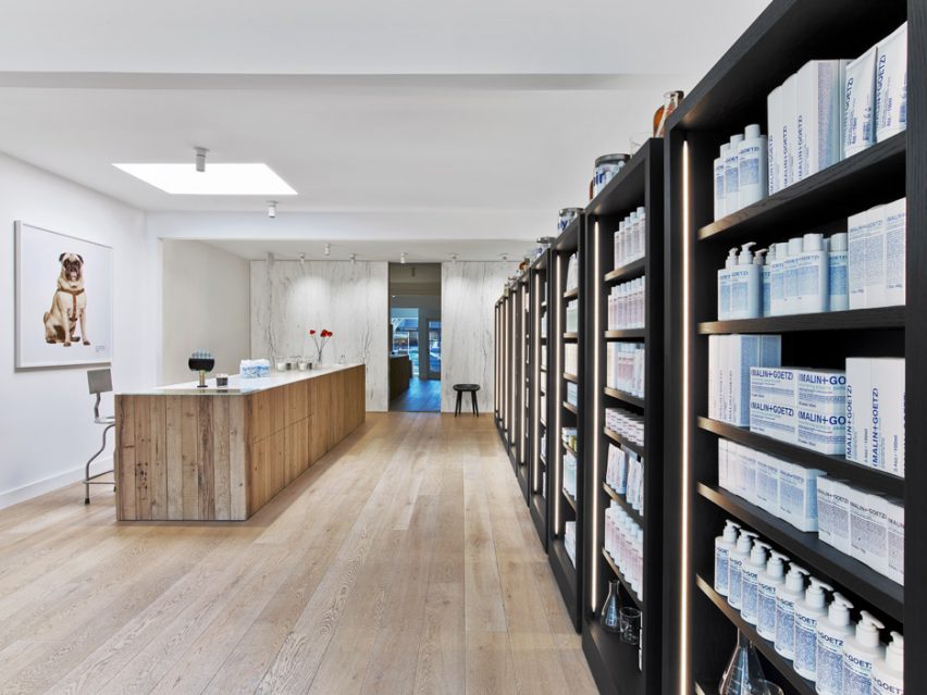
Products are displayed on nine shelving fixtures made of black-painted wood, which "march in unison from the front to the back of the store".
The units are separated by four-inch (10-centimetre) gaps, which reveal wall-mounted fluorescent light fixtures.
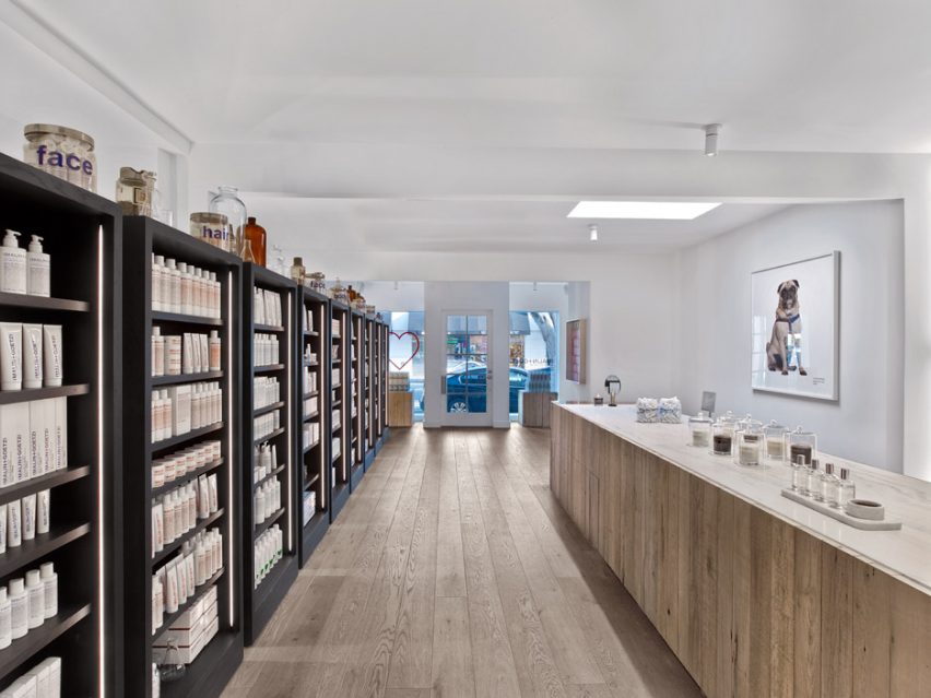
Opposite these units is an elongated sales counter made of reclaimed oak and marble.
A "larger-than-life portrait" of Mr Greenberg – a dog belonging to the owner of Malin+Goetz – looks over the counter and pays homage to the site's history as a pet grooming facility.
The skincare brand also recently opened a pair of stores in London – both designed by Jonathan Tuckey but with contrasting interiors.
Photography is by Eric Laignel.
