Movie: RIBA Stirling Prize 2010 shortlist
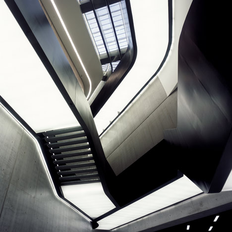
In anticipation of tonight's announcement of the RIBA Stirling Prize 2010 winner here are six videos about the shortlisted designs including the bookmaker's favourite, the MAXXI National Museum of XXI Century Arts in Rome (above) by Zaha Hadid Architects.
Can't see the movie? Click here
Captions are from the RIBA
MAXXI, National Museum of XXI Century Arts
Rome, Italy
Architect: Zaha Hadid Architects
Client: Ministry of Cultural Heritage and Activities,
Fondazione MAXXI and Ministry of
Infrastructure and Transport
This is a museum of paths and routes, as a series of flexible spaces where the curators invent new ways to hang and place the works of 21st Century art that have been collected since inception of the project – and the century. The permeable plaza recreates routes and connections, but also forces you to consider the new context that is created to engage with the activities within.
MAXXI is a building for the staging of art, and whilst provocative at many levels, it shows a maturity and calmness that belies the complexities of its form and organisation. Yet for all its structural pyrotechnics, it is rationally organised as five main suites. The whole is bravely day lit with a sinuous roof of controllable skylights, louvres and beams, whilst conforming to the strict climate control requirements of modern galleries; the skylights orientate and excite the visitor, while turning them into uplifting spaces.
Can't see the movie? Click here
Neues Museum
Museum Island, Berlin, Germany
Architect: David Chipperfield Architects
in collaboration with Julian Harrap
Client: Prussian Cultural Heritage Foundation
The Neues Museum was designed by Friedrich Stüler to show off the archaeological and scientific prowess of one of Europe’s leading powers. It was Prussia’s answer to Britain’s Great Exhibition of 1851. The museum houses Egyptian and Pre / Early History archaeological collections and is a centre for active scientific research and public education. This duality lay at the heart of the project organization and was matched by a close collaboration between Chipperfield’s and conservation architect Julian Harrap, resulting in a coherent and holistic piece of architecture.
The key architectural aim was to reinstate the original volumes and to repair the parts remaining after the war. The original sequence of rooms was restored by the new spaces thereby creating continuity with the existing structure. The Museum Directorate has not over-faced the visitor with exhibits. Less is indeed more in both the architecture and the display – lessons for other museums and galleries here.
Can't see the movie? Click here
Clapham Manor Primary School
London SW4
Architect: dRMM
Client: Lambeth AMPD
This jewel-like project is a freestanding addition to a 19th Century Board School which, in the words of the designers, plugs into the existing building allowing it to work as a single entity.
The multi-coloured glass cladding is the first thing which strikes you, but this is no straightforward glass box. The panels, although all glazed externally, internally can be transparent, translucent or opaque. As well as greatly enhancing the energy performance of the building, this arrangement adds a degree of intimacy and privacy to the teaching spaces.
The project results from a positive collaboration between the architects, their teams and a strong headmaster with a very clear educational vision and provides an inventive and uplifting example of what the next generation of school buildings could be. It also avoids generic solutions and looks to use the very best contemporary thinking about what makes a good education environment.
Can't see the movie? Click here
Christ’s College School
Guildford
Architect: DSDHA
Client: Diocese of Guildford
This does not look like Guildford; it does not even look like Britain, rather we might be in Switzerland or Scandinavia, where good architecture has long been a pre-requisite for good education. With its generous approach and its rich brown brick elevations, it stands as a beacon for an all-too-short-lived commitment to the notion that design quality leads to better places for children to learn and develop.
This clever design for a secondary school achieves a great deal on three compact levels, yet has a gratifying generosity of circulation and inner courtyard spaces. The central atrium space at the heart of the school provides a focus for the school community.
The building embodies an innovative natural ventilation system, which works well on the hottest of summer days and is subtly manifested on the deep brown brickwork of external walls as occasional patterns of gaps in the pointing.
Can't see the movie? Click here
Bateman's Row
London EC2
Architect: Theis and Khan Architects
Client: Soraya Khan and Patrick Theis
This is a clever development by an architect-client couple for a mix of uses including their home and office. It is on five floors over a basement and completely fills its corner site. The mix includes four dwellings: the house over three floors, three small flats, the architects’ own studio and an Art Gallery. In section the scheme skilfully adjusts the floor heights, creating taller spaces for the gallery, the studio and the principle living space.
The architects have found a way of developing a tight, difficult site in a way that is both spatially and aesthetically rich. In its response to its surroundings, its scale and its mix of uses, this development defines a vision for the future of Shoreditch. It has a fortress-like quality and provides an environment for family-living within a tough urban context.
This is the kind of building London – and a depressed market – need a lot more of.
Can't see the movie? Click here
Ashmolean Museum
Oxford
Architect: Rick Mather Architects
Client: Ashmolean Museum
Entered through the 19th century Cockerell façade, the eye is drawn to a day-lit space beyond. This central atrium, modest in plan yet dramatic in section, rises through six floors and provides excellent light quality even at the lower ground level, while avoiding levels that could damage exhibits. The pellucid light washing down the atrium bathing polished plaster walls, has an almost surreal quality. The visitor route navigates a way through a clever interleaving and interconnection of double and single height spaces that creates a rich spatial journey.
The building has virtually no external walls but seven different party walls. Yet this is by no means ‘mere’ interior architecture. Rather it is the culmination of a working lifetime spent by the architect refining the detailing of galleries, houses and restaurants to create a deeply satisfying series of interlocking spaces. This is a world-class building.
The winning project will be announced at an award ceremony in London this evening and and broadcast live in the UK on BBC 2 programme The Culture Show (more details in our Dezeenwire story).
More about the shortlisted designs »
More movies on Dezeen »
See also:
.
 |
 |
 |
| RIBA Stirling Prize shortlist 2010 |
2010 RIBA Award winners announced |
RIBA Stirling Prize shortlist 2009 |