025
025
Aesop
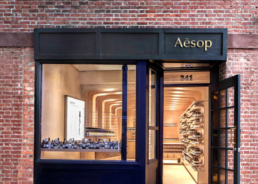
Melbourne-based skincare brand Aesop is well-known among Dezeen readers for its outlets around the world. The brand works with different architects almost every time, meaning no two stores are the same.
Interestingly one of the most popular stories about the brand this year was our 2012 interview with Aesop founder Dennis Paphitis, in which he set out the brand's philosophy and explained his approach to store design.
Popular Aesop interiors over the past year have included an outpost in Nottingham designed by Paris studio Ciguë and a store in Sapporo by Case-Real that references snowy Japanese mountains.
However, the brand's biggest design statement this year – and our most popular Aesop post – is its new UK headquarters located in a former London warehouse. This was designed by Post-Office, the studio run by Dezeen favourite Philippe Malouin and which also designed the former Dezeen office in north London.
Top posts:
1. Post-Office creates "simple and elegant" UK headquarters for Aesop
2. Distillation apparatus forms centrepiece in Ciguë's Aesop Nottingham store
3. "I was horrified at the thought of a soulless chain" - Aesop founder
4. Case-Real references snowy Japanese mountains with Aesop Sapporo store interior
5. Dezeen's top 10 Aesop store designs


