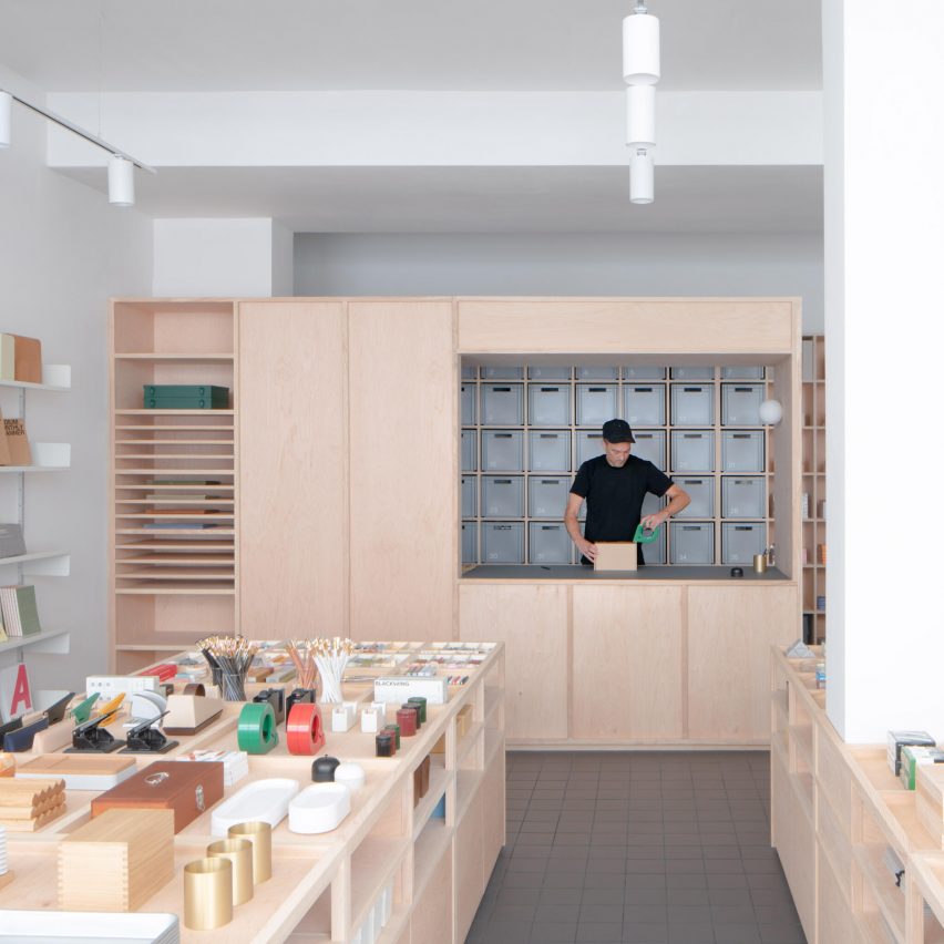
Architecture for London has designed the interiors of Present & Correct Shop in London, United Kingdom.
The Present & Correct shop's brief called for a demountable interior, allowing the project's lifespan to extend beyond the lease of the location.
A muted palette of maple plywood and ash timber pairs with a tile floor, Vitsœ shelving and new LED lighting throughout.
Referencing the neighbouring British Museum, cabinets are imagined as a series of 'wunderkammer' that exhibit the stationery as objects of desire.
"Present & Correct's identity is translated through a grid inspired by the ISO 216 A chart, which influences the perception of nearly all printed images in Europe," said Architecture for London.
"This grid traverses the surface of the shop cabinetry."
This project has been longlisted in the retail interior (small) category of Dezeen Awards 2024.
Studio: Architecture for London
Project: Present & Correct Shop


