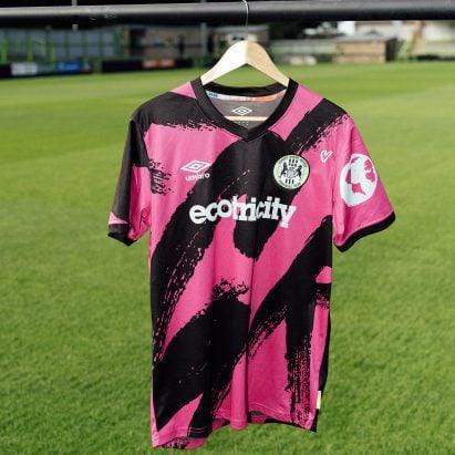
Climate change graphs hide in Forest Green Rovers football kit
Gloucestershire-based football club Forest Green Rovers has unveiled its new kit for the 2024/25 season, featuring details that draw attention to the effects of climate change. More

Gloucestershire-based football club Forest Green Rovers has unveiled its new kit for the 2024/25 season, featuring details that draw attention to the effects of climate change. More
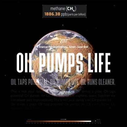
Methane data and dishonest oil company advertising are juxtaposed in Smoke and Mirrors, a new visualisation produced by artist and musician Beatie Wolfe in collaboration with visual effects studio Parliament. More

On the heels of taking home this year's Pulitzer Prize for illustrated reporting, journalist Mona Chalabi discusses the pitfalls of visualising skewed data and the Israel-Hamas conflict in this exclusive interview. More

For AI to properly emulate human emotions the field must become more inclusive, machine-learning art pioneer Refik Anadol says in this interview. More
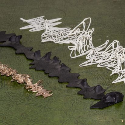
An anthropologist and an architect from University College London have collaborated on a unique way to preserve endangered languages – by capturing their character in the form of 3D-printed objects. More
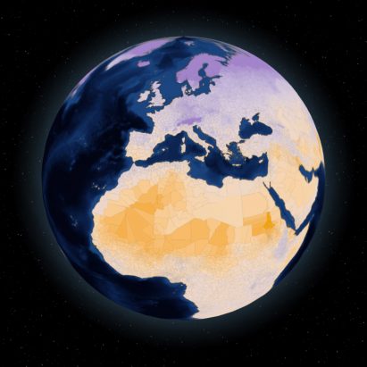
A data platform showing how different levels of global heating will affect people's lives around the world has been launched by the United Nations. More
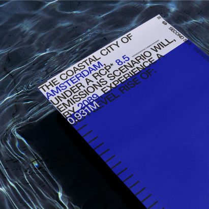
In time for the COP27 climate summit, a team of researchers led by architect Adrian Lahoud has developed an app that calculates how much coastal cities are owed in climate reparations to make up for the destruction wrought by rising sea levels. More
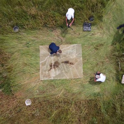
Design graduate Liselot Cobelens has presented a rug at Dutch Design Week that visualises real-world data on how climate change-induced droughts are damaging local landscapes. More
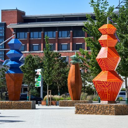
The impact of climate change on the UK city of Liverpool is visualised in these three towering sculptures by Polish artist Alicja Biała, whose work gives physical form to environmental data. More
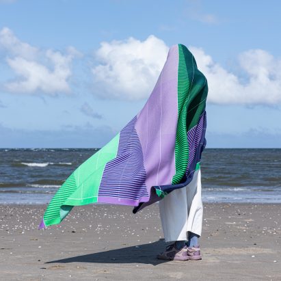
To raise awareness about environmental issues and provide a way to keep warm without turning on the heating, Dutch design studio Raw Color has created the Temperature Textiles collection, which is embedded with climate-change data. More
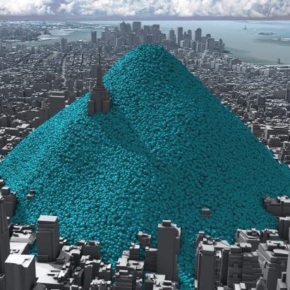
A 2012 animation showing New York City being buried under a mountain of giant bubbles allowed people to appreciate the scale of carbon emissions for the first time, according to its creators Real World Visuals. More
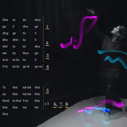
Design graduates from Boston's Northeastern University present thesis projects including visualisations of traditional Indian dance moves and augmented-reality representations of taste in this Virtual Design Festival school show. More
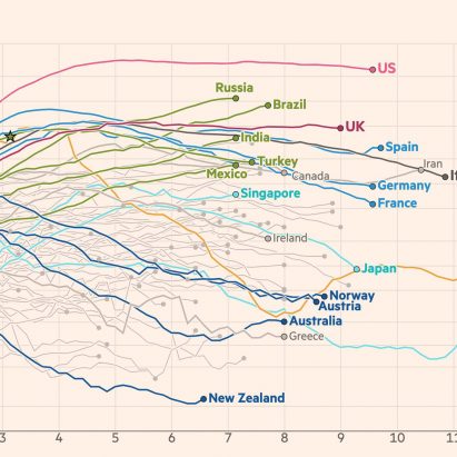
Daily data visualisations created by John Burn-Murdoch for the Financial Times have provided one of the most reliable pictures of the global coronavirus pandemic. He spoke to Dezeen about how his charts allow people to be independently informed. More
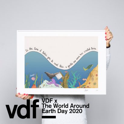
Data journalist and illustrator Mona Chalabi has unveiled a series of limited-edition prints and shared a selection of her illustrations visualising information about coronavirus as part of The World Around's takeover of Virtual Design Festival for Earth Day. More
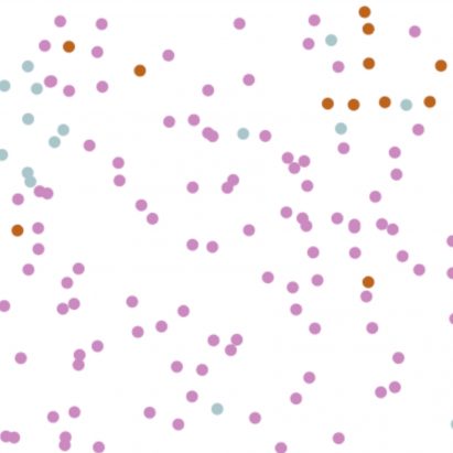
Infographics that reporter Harry Stevens created to explain how coronavirus spreads have become the most-viewed story ever published on The Washington Post. More
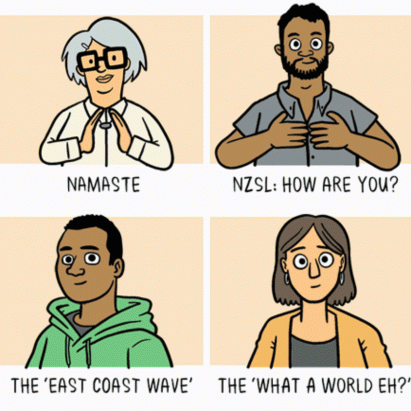
Animated illustrations by cartoonist Toby Morris and microbiologist Siouxsie Wiles explaining the importance of social distancing during the coronavirus outbreak have gone viral after they were published by a website in New Zealand. More
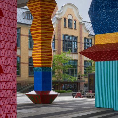
Designer Alicja Biała and architect Iwo Borkowicz have aimed to capture the realities of climate change with these colourful Totemy towers that serve as multi-storey data visualisations. More