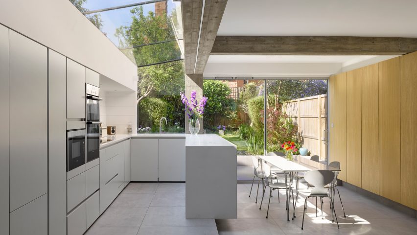
Paul Archer uses board-marked concrete and glass for London house extension
Coarse concrete walls contrast transparent glazing in this extension designed by Paul Archer Design to create a light-filled kitchen and dining room for a north London house.
London-based Paul Archer Design added the 15-square-metre addition to the rear of Tibur House to create a bright, open-planned kitchen, dining area and lounge at ground level.
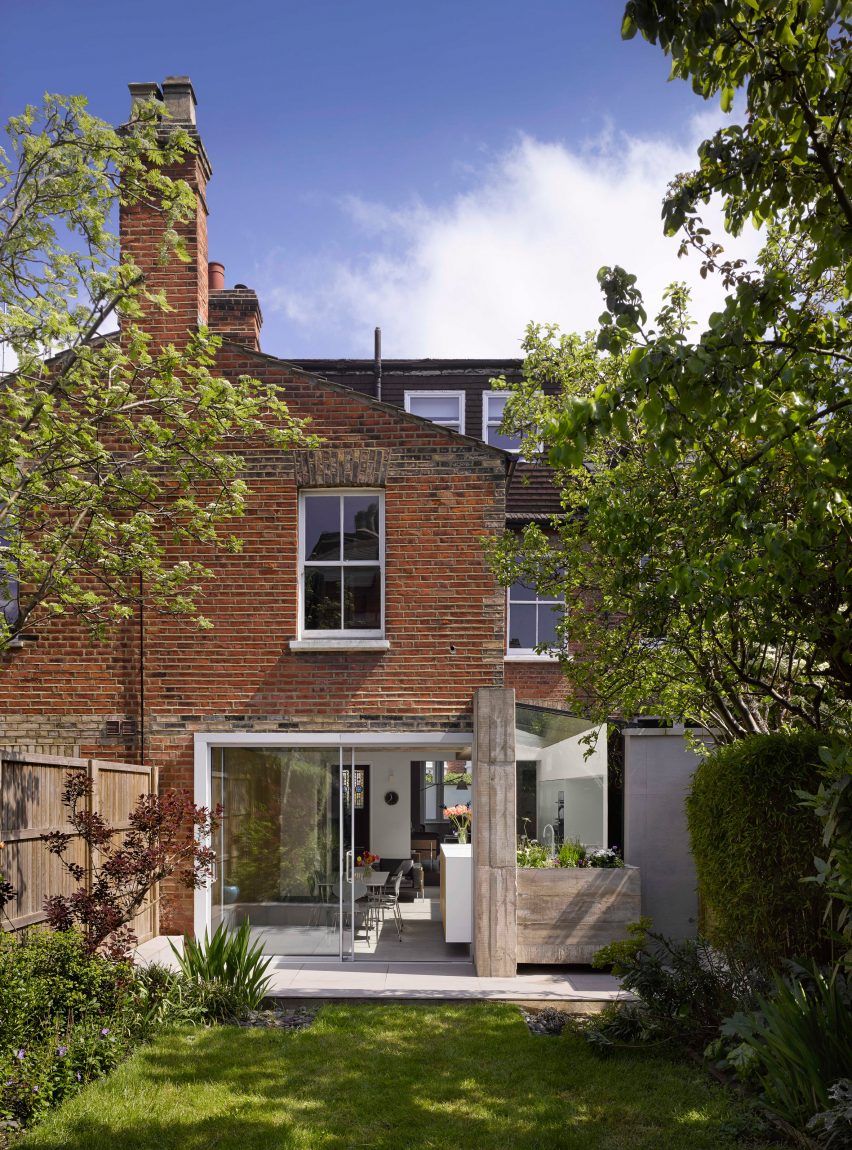
The architects removed a side wall at the rear of the property to form the extension, and used a cast in-situ concrete structure with a board-marked surface to support the opening left behind.
"This strip of yard that runs alongside the rear wing between the neighbouring garden wall is often overshadowed and under utilised," said the architects.
"It provides an obvious area to extend the kitchen, dining and living spaces into, to suit the needs of the owners," they continued.
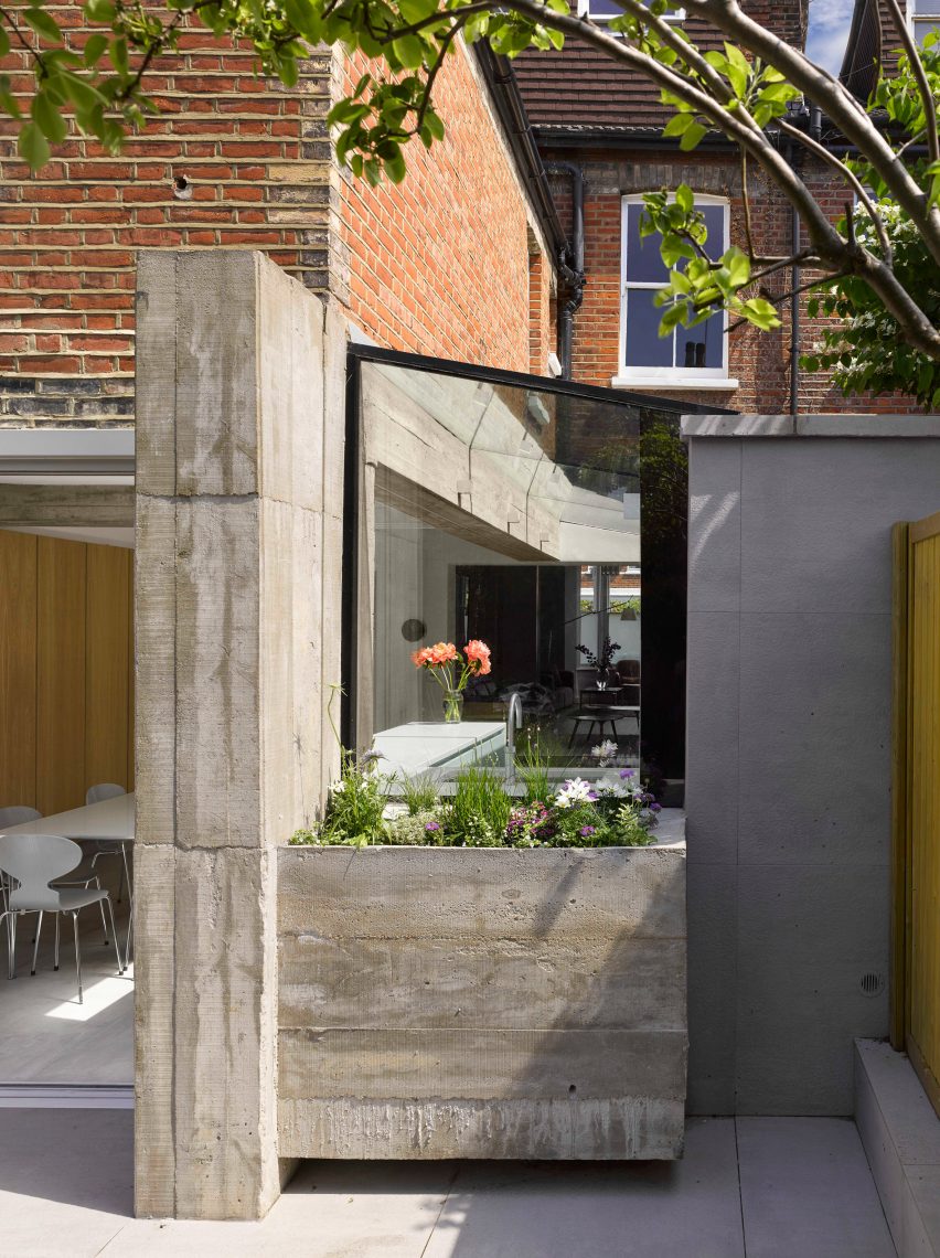
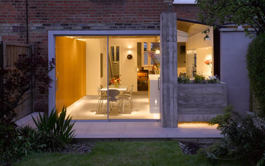
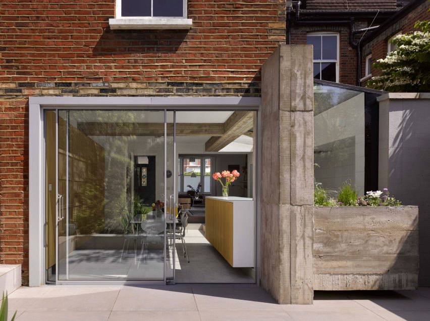
Glazing slots into the gap between the house and a neighbouring garden wall to enclose the space, while a concrete planter filled with greenery cantilevers out at the rear beside a concrete wall.
On the other side of this wall, large sliding glass doors open the living areas to the garden.
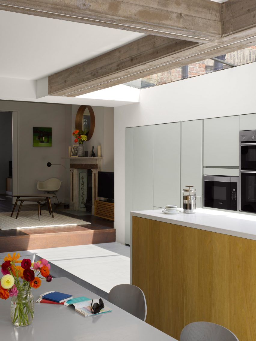
"The board-marked surface of this in-situ concrete side-return extension presents a bold expression of the structural changes to Tibur House," explained the architects, who wanted to highlight rather than disguise their structural work.
"The rough surface of the concrete contrasts with, and seamlessly meets, the smoothness of the minimal glazing."
Inside, the concrete beam and column mark the division between the dining area in the existing building and the kitchen placed beneath the glazed extension.
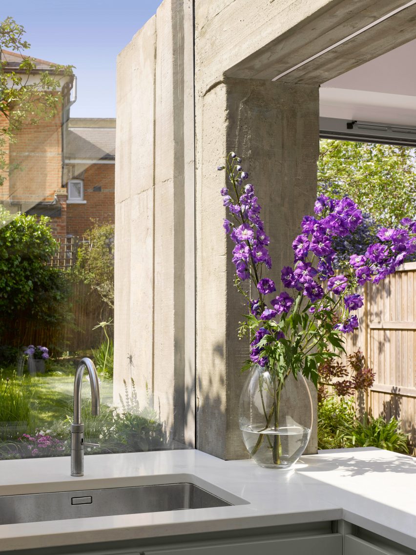
The kitchen is raised on a slightly higher level and features a kitchen island fronted with oak, which cantilevers out over the step. The sink is placed to offer views towards the garden while washing up.
The architects also partially removed the wall between the front and rear lounge rooms to open to improve natural lighting. A sliding partition allows the rooms to be closed off for privacy.
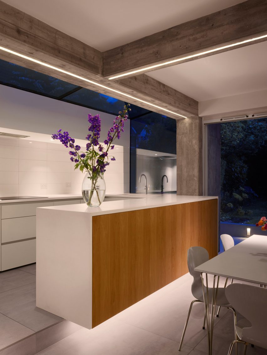
A palette of cool blue-greys and white is used in the kitchen and flows through the space out onto the patio. Oak panels running along the wall of the dining room are intended to create a warm atmosphere.
The same palette of materials continues into the newly created utility space in the former cellar.
Founded in 1999 by director Paul Archer, the studio came 79th in the augural Dezeen Hotlist Architects ranking – a guide to the most newsworthy players in the architecture and design industry.
Paul Archer Design has completed a series of additions to residences in London. These include a townhouse featuring glass and marble for extension and another with a window inspired by abstract art.
The demand for contemporary house extensions is continuing across the capital, with recent projects including a property in East Dulwich with a three-metre-high pivoting door and an extension in the north of the capital topped by a butterfly wing-shaped roof.
Photography is by Will Pryce.
Project credits:
Architect: Paul Archer Design
Project architect: Richard Gill
Contractor: Build Decor
Structural Engineer: Martin Redston Associates