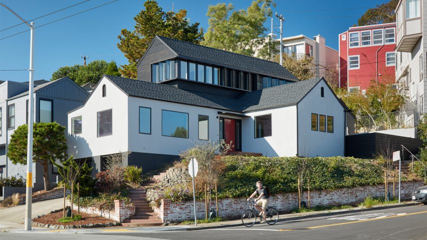
San Francisco architecture firm Spiegel Aihara Workshop has extended a 1930s hillside residence by duplicating its layout and stacking it over the original structure, raising the home so it looks over the city's landmarks.
The A-to-Z House sits against an incline that slopes down towards the bay. Despite its ideal location, the residence was previously too low to enjoy views of nearby historic sites.
"Perched on a hillside in Golden Gate Heights, a modest single story 1934 developer vernacular structure had limited space and failed to take advantage of expansive views of Sutro Tower, Golden Gate Park, Sausalito, and the Bay," said Spiegel Aihara Workshop (SAW).
While renovating the home, the architects partly retained the old building – white plaster walls support a gabled roof over an L-shape layout. To create the extension, the structure was replicated, tweaked, and inserted back into the home.
The short leg of the addition's L-shaped plan sits next to its original counterpart, while the long section was elevated onto a second floor.
Though the corner structurally connects the two segments, the architects divided the interior of the extension's nexus between two floors.
The A-to-Z house takes its name after the design process. The architects copied the previous structure –ending in two A-shaped facades – offset it along the Z-axis, and lodged back into the building.
The aggregation of similar forms maintains unity across the exterior. Though the white walls of the original building contrast with the blackened wood panels of the addition, the repetition of angled silhouettes creates a cohesive whole.
Glazing also helps to unify the outside by creating a transition. Where the two volumes intersect on the ground floor, the architects placed a thin strip of glass.
A row of windows wrapping around three sides of the upper volume marks where the firm placed the extension into the old roof.
Inside the home, the architects joined its two parts seamlessly. Large, minimally framed windows were inserted across the building, while white-washed walls and light-wood flooring throughout help to reflect the added light and make the interior feel spacious.
At the inner corner of the L-shaped plan, the entrance opens onto a lounge at the east end of the ground floor, overlooking the street. The dining room to the right of the entrance is combined with a kitchen in the extension, forming a broad space.
On the west facade, a large glass door leads out to the terraced garden stepping up the hill. A bedroom takes up the southwest corner.
The square intersection among the west ground-level rooms accommodates a staircase leading up to a landing on the extension's upper level.
The architects divided the volume into two slightly offset spaces, and connected them via a short flight of steps from the central passage.
A bedroom with high ceilings takes up the west half, while a study is situated at a slightly higher level in the east section.
As the row of windows along the first floor remains level, the glazing in the upper two rooms offers different angles from which to appreciate the surrounding scenery.
"Inside, variations of the floor level and ceiling height provide different ways to experience this horizon in each space, from sweeping vista to private lookout," said the architects.
Other hillside residences renovated to take advantage of San Francisco Bay's scenic views include a 1930s cottage with floor-to-ceiling glazing and a mid-century-modern home featuring verdant terraces.
Photography is by Bruce Damonte.

