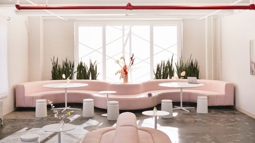
Pale pink shades and red accents are found throughout the Manhattan offices of beauty brand Glossier, which New York architect Rafael de Cárdenas designed to evoke the company's rosy branding.
De Cárdenas and his studio Architecture at Large created the interiors for the SoHo headquarters of Glossier, a direct-to-consumer beauty company founded in 2014 by Emily Weiss.
The brand is popular for its pink reusable pouch made from a bubble wrap and ziplock construction, and uses rose-tone branding in general, which the team referenced for the decor.
"The brand's signature pink and red are applied sparingly: in the upholstery of a sofa, for example, or in the powder room's vivid Corian countertops," said a project description. "Delicate chromatic treatments serve to both unify and vary the overall space of the headquarters: pale, optically subtle hues dominate."
Spanning a full floor, the layout is based around a central block of private offices. The space also includes a reception, an open-plan desk area, meeting rooms, a kitchen and bath, and a lounge with modular furniture that allows for workplace variation.
The large undulated seating and banquettes were custom-designed for the project, paired with white Last Stools by Max Lamb for Hem, and Arper tables.
The sitting area is accented with cove lighting overhead, between each existing ceiling beam. "The ceiling is illuminated without seeing the light source, as if the roof was missing," the description said.
Indoor plants and flowers feature alongside vintage pieces to create an eclectic and intimate, yet contemporary, atmosphere for working.
In the reception area is a black Periscopio floor lamp by Danilo and Corrado Aroldi for Stilnovo, a cream-coloured desk, and a Kvadrat Maharam sofa that can be reconfigured into various shapes.
Other vintage pieces include Weiman Preview art deco chairs, nesting tables by Gianfranco Frattini for Cassina, and a 1940s cast-iron garden bench.
Chrome and white mesh stacking chairs by David Rowland for Thonet Sof-Tek were sourced from Odd Eye in New York's East Village.
White walls, concrete floors, and accents of caramel and cream create a neutral backdrop for the pink items. Pipework suspended from the ceiling is painted bright red as an even bolder statement.
"We chose industrial colours like muted beiges and browns and left the inherited floors as is to complement the brand’s pinks and reds," said de Cárdenas in an interview with Dezeen.
A powder room has a bright red vanity inspired by the bathrooms at Radio City Music Hall, accompanied by a translucent pink Glow Chair by Kim Markel and soft pink bathroom stalls.
Glossier products are displayed in a glass vitrine that resembles a high school trophy case, located close to the office locker rooms.
A kitchen has vanilla-coloured Corian counter tops, white acrylic cabinets and Hay dishware.
De Cárdenas has also designed a home in Brooklyn for himself, with a similar mixture of vintage furnishings alongside red and cylindrical pieces.
Photography is by David Allee.

