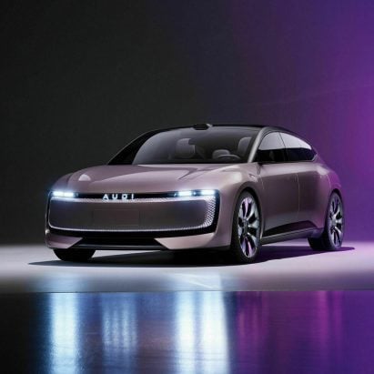
Audi ditches four-ring logo for Chinese electric car range
Audi has unveiled the visual identity for its new Chinese EV brand, which sees the carmaker's distinctive four-ringed logo replaced with an all-caps AUDI wordmark. More

Audi has unveiled the visual identity for its new Chinese EV brand, which sees the carmaker's distinctive four-ringed logo replaced with an all-caps AUDI wordmark. More

New York design studio Order has created a nostalgic new brand identity for Herman Miller that harkens back to the mid-century modern heritage of the American design brand. More

To reflect the restrictive winemaking regulations in the French region of Bordeaux, Norwegian studio OlssønBarbieri set itself constraints when coming up with a playful brand identity and packaging design for the winery Château Picoron. More

Plastic makes way for moulded paper in this chocolate packaging designed by Norwegian practice OlssønBarbieri to inspire a more mindful approach to materials. More
The envelope stamped with the red letter M, which has featured in every Gmail logo since its launch in 2004, has been abandoned as part of a new simplified, multi-coloured brand identity for Google's G Suite tools. More

Toyota Motor Europe has joined numerous other car brands by opting for a flat redesign of its logo with a revised visual identity created by The&Partnership that includes removing its wordmark. More
German car manufacturer BMW has revealed a new minimalist, flat logo with a transparent backdrop. More

This new logo created by Hemingway Design for the Dreamland theme park in Margate, England, combines traditional seaside colours with a minimalist aesthetic. More

Dutch branding agency Studio Dumbar has designed a new visual identity for the Netherlands featuring a logo that combines the letters NL with a stylised tulip. More

Spanish branding agency Summa has subtly rebranded Correos, the Spanish national postal service, with a simplified logo for the digital age and a new typeface. More

Creative agency Creuna Norway has worked with citizens of Oslo to create a new visual identity for the city inspired by its buildings and history. More

Richard Baird has created a quarterly magazine to celebrate minimalist mid-century logos. Speaking to Dezeen the London-based designer picks five of his favourite examples. More
New York branding and graphics firm Chermayeff & Geismar & Haviv has pared back the "complicated" flaming ball logo of the US Open Tennis Championships to just three yellow stripes and lower-case text. More
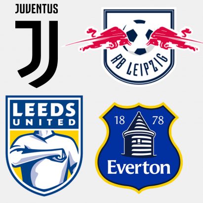
With football club Leeds United facing backlash from fans over its redesigned crest, here's a look at some of the sport's most controversial rebrands – from the minimal redesign of Juventus' logo to Red Bull's creation of RB Leipzig. More
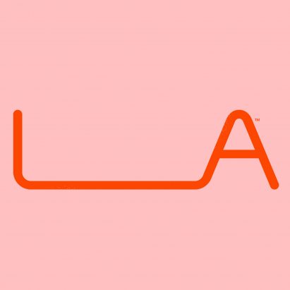
Advertising agency 72andsunny has designed a logo and campaign for an initiative highlighting creative entrepreneurs in Los Angeles, with a long space in between the letters L and A that users can customise. More
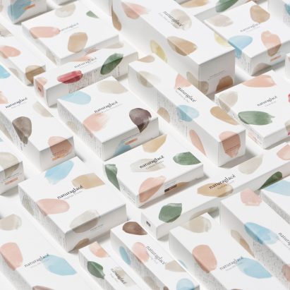
Nendo has used brush strokes in soft, pastel hues for a range of minimal packaging for an organic cosmetics company. More
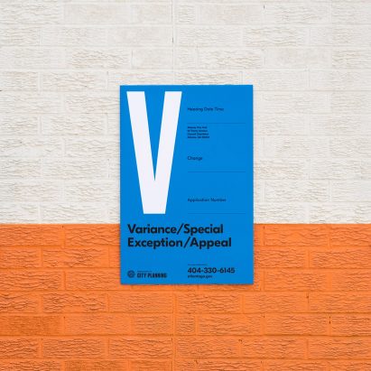
Brand identity firm Matchstic has worked with Atlanta's Department of City Planning to redesign its branding and create new zoning signs around the city. More
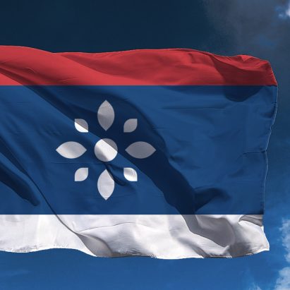
Graphic designer Vladan Pavlović has proposed a new visual identity for the Republic of Serbia that presents the Balkan country as one of "peace, democracy and tolerance". More
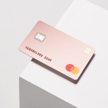
This bank card by Blond forgoes embellishment in favour of a minimal look to provide a "premium experience" for Revolut users. More
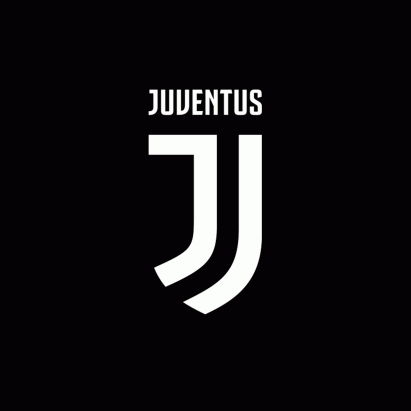
Italian football club Juventus has unveiled its new crest, but the team's fans think the minimalist rebrand is an own goal. More