BMW unveils flat logo in first rebrand for two decades
German car manufacturer BMW has revealed a new minimalist, flat logo with a transparent backdrop. More

German car manufacturer BMW has revealed a new minimalist, flat logo with a transparent backdrop. More
Creative agency Havas has designed a new brand identity for British condom manufacturer Durex, which features a flattened logo written in One Night Sans typeface in a bid to challenge "repressive" sexual norms. More
Snøhetta has teamed up with the Wikimedia Foundation to develop a new visual identity for its global organisation that will be generated in partnership with volunteers from around the world. More
Dutch branding agency Studio Dumbar has designed a new visual identity for the Netherlands featuring a logo that combines the letters NL with a stylised tulip. More

Facebook has launched a new branding for its subsidiary companies, which comprises an all-capital typeface that changes colour depending on the service offered. More

Volkswagen has scrapped its chrome-effect logo for a flat "digital-first" visual identity to mark the "start of a new era", which has been kickstarted with a line of fully electric cars. More
Spanish branding agency Summa has subtly rebranded Correos, the Spanish national postal service, with a simplified logo for the digital age and a new typeface. More

London studio Red&White is behind the new minimal logo of telecommunications company BT. Studio founder Paul Franklin told Dezeen that confidence was the key to rebranding the British icon. More
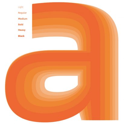
Chinese e-commerce giant Alibaba has released a new custom typeface that its partners, sellers and consumers can use free of charge to establish their own brand identities. More
Swedish furniture giant IKEA has unveiled an updated logo, although the changes will only be spotted by those with a keen eye for detail. More
Swiss design duo Régis Tosetti and Simon Palmieri have rebranded luxury menswear brand Christopher Raeburn and introduced a new logo that references the company's heritage. More
Pentagram has adapted the logo of workplace messaging system Slack into a pattern of speech bubbles and lozenge shapes as part of a rebranding effort. More
Pentagram has removed Mastercard's name from its logo, meaning the credit card company will now use only the red and yellow intersecting circles as its brand mark on cards and at physical and digital retail payment points. More
The medal handed out to Nobel Prize winners at the first awards in 1901 is the inspiration behind Stockholm Design Lab's rebrand for the prestigious awards. More

Pentagram and Map have set out to prove that computer hardware doesn't have to be "cold, dark boxes", by designing colourful products for machine-learning technology startup Graphcore. More
The silhouettes and movement of speeding racing cars influenced the slanted lettering of this wordmark, designed by Pentagram's New York office as part of a rebrand for an online auto trader. More
Brand consultancy Summa has subtly re-designed FC Barcelona's badge, and created a new personalised typeface and visual system for the football club. More
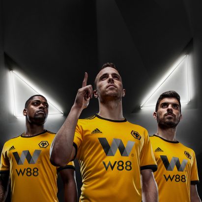
The new visual identity for Premier League football team Wolverhampton Wanderers, better known as Wolves, centres around a 3D version of its wolf badge. More

Uber has scrapped its controversial and confusing "asshole" symbol for a simple wordmark, as part of its new visual identity designed with branding firm Wolff Olins. More
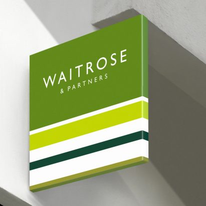
Pentagram partner Harry Pearce has created a unified brand identity for John Lewis and Waitrose adding the words "& Partners" to each brand's name to draw attention to the employee-owned business model. More